- Products

- Developers
- User stories
- Blog
- Pricing

Building a Pusher Chat using Realtime Web Components

In this tutorial, we will build a Pusher chat component using the native web components specification. We will cover the current support across browsers for the features that come under the "web components" umbrella, and then discuss how we polyfill across browsers that don't currently have full support.
Introduction
In this tutorial, we’ll build a Pusher chat component using the native web components specification. Web Components feel like they’ve been around for ever; a quick google search shows blog posts from early 2014 talking about the specification and what they will bring to the web, and the specs first began to surface as early as 2011.
Fast forward to 2016 and the landscape of web components isn’t clear; libraries like React, Ember, Angular and others have popularised the idea of building with components yet few developers are using the native web components specification, and few popular libraries are relying on them under the hood. In this post I’ll cover the current support across browsers for the features that come under the “web components” umbrella, and then discuss how we polyfill across browsers that don’t currently have full support. I’ll then build a Pusher based web component that provides a small realtime chat widget, and look at how easy it is with web components to reuse it across other projects.
Browser Support
Before diving into browser support it’s important to define what we really mean when we say “Web Components”. There are four individual specifications that make up web components:
- Custom Elements – these allow us to create custom HTML elements in the browser with JavaScript.
- Shadow DOM – a way to scope CSS to a web component and create local DOM elements for a component that’s hidden from the rest of the page.
- HTML Imports – these let us import HTML files that contain not only HTML but JavaScript and CSS too. A user using our component imports one HTML file and gets all the behaviour of our component without having to include multiple files.
- HTML
<template>tag – this lets us define inert HTML that can be used as a template for our web components.
Don’t worry if any of those aren’t clear right now; we’ll cover all four of them in this post. For a browser to support “Web Components” it must have full support for all four of the above. At the time of writing, according to caniuse.com, only Google Chrome 45+, Opera 38+ and Chrome for Android 51+ have full support.
Polyfills
Luckily for us there exists a suite of polyfills that provide full support across browsers for web components. To make sure we’re supporting all browsers, we’ll use this polyfill in our application.
You can find polyfills for the individual specs that make up web components, or you can simply grab the full WebComponents polyfill from GitHub. Once you take that and put it into your page you’re ready to start writing a web component!
Hello World
First I create index.html, which will load in the web component polyfill:
1<!DOCTYPE html> 2<html> 3 <head> 4 <title>Pusher Web Components</title> 5 <script src="vendor/webcomponents.min.js"></script> 6 <link rel="import" href="/hello-world-component/hello-world.html" /> 7 </head> 8 <body> 9 </body> 10</html>
Notice that I then use a <link rel="import" ...> to import an HTML file. This file will contain the Hello World component that we’re about to write. This is how people will use our web component – one HTML file can be imported which contains all the scripts, CSS and HTML that it requires. This is great because a user can import our component without having to know about its inner parts, or include a separate stylesheet.
Within hello-world-component/hello-world.html I’ll first add a script tag that will contain the JS for our component.
1<script> 2 var HelloWorldProto = Object.create(HTMLElement.prototype); 3 document.registerElement('hello-world', { 4 prototype: HelloWorldProto 5 }); 6</script>
To create a new HTML element we use document.registerElement, giving it the tag we’d like to use (hello-world) and an object that configures the component. We create the prototype for this element from the HTMLElement‘s prototype. Note that web components must have a dash in their name – this is what lets the browser distinguish between native HTML elements and web components. This means even if you would like to call your component a single word, such as chat, you’ll have to come up with something to add to it. If you can’t think of anything else you can always add -component onto the end!
This means we now have a <hello-world> component defined, but right now there’s not much to it. Let’s define a template for what this component should look like. Within the same HTML file, above the <script> tag we just wrote, add the following:
1<template id="hello-world-template"> 2 <div class="hello-world"> 3 <h1>Hello, World!</h1> 4 </div> 5</template>
Now when our new component is created we can write some code to grab the template and add it to the component as HTML. To do this we’ll define a method on the prototype called createdCallback, which is called when the web component is first created.
Our JavaScript now looks like so:
1<script> 2 var HelloWorldProto = Object.create(HTMLElement.prototype); 3 // this is a deviation from the native spec 4 // the polyfill uses _currentScript rather than currentScript 5 var importDoc = document._currentScript.ownerDocument; 6 7 HelloWorldProto.createdCallback = function() { 8 var template = importDoc.getElementById('hello-world-template'); 9 var clone = importDoc.importNode(template.content, true); 10 this.appendChild(clone); 11 } 12 13 document.registerElement('hello-world', { 14 prototype: HelloWorldProto 15 }); 16</script>
To access the template element we have to use document._currentScript.ownerDocument. This lets us reference the HTML document that our component is defined in, rather than the HTML document that it’s being used in. Note that there’s a deviation from the specification here – in native web components you can use document.currentScript but the polyfill uses document._currentScript. This isn’t a big problem and one that’s easily fixable with a find and replace once we remove the polyfill when browser support improves.
In the callback we grab the template, clone it using importNode and attach it to the component:
1HelloWorldProto.createdCallback = function() { 2 var template = importDoc.getElementById('hello-world-template'); 3 var clone = importDoc.importNode(template.content, true); 4 this.appendChild(clone); 5}
And with that we can use our component inside our HTML file:
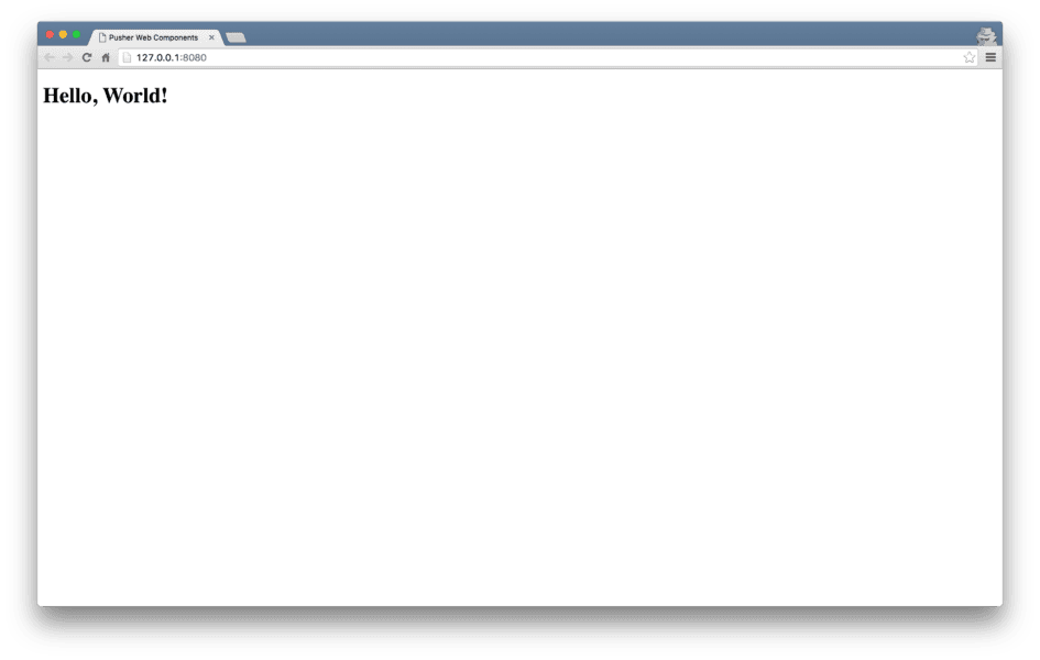
1<body> 2 <hello-world></hello-world> 3</body>
And see “Hello, World!” on the page!
Building Pusher Web Components
Now we’ve got a sense of using web components let’s build something a bit bigger, a Pusher chat box component. The end goal here is to enable a user to place the following into their page:
1<pusher-chat name="Jack"></pusher-chat>
That will join them to a chat room with the name “Jack” and let them start chatting. Let’s get going!
Creating the component
I’ll create a new folder, pusher-chat-component, and add pusher-chat.html inside it. Inside the file I’ll add a template tag, the basic JS to create the component and also a <script> that pulls in the PusherJS library for us:
1<script src="https://js.pusher.com/3.1/pusher.min.js"></script> 2 3<template id="pusher-chat-template"> 4</template> 5 6<script> 7 var PusherChatProto = Object.create(HTMLElement.prototype); 8 var importDoc = document._currentScript.ownerDocument; 9 10 PusherChatProto.createdCallback = function() { 11 var template = importDoc.getElementById('pusher-chat-template'); 12 var clone = importDoc.importNode(template.content, true); 13 this.appendChild(clone); 14 } 15 16 document.registerElement('pusher-chat', { 17 prototype: PusherChatProto 18 }); 19</script>
I’ll also update the main HTML page to pull in and create this component, even though right now it won’t do anything:
1<!DOCTYPE html> 2<html> 3 <head> 4 <title>Pusher Web Components</title> 5 <script src="vendor/webcomponents.min.js"></script> 6 <link rel="import" href="/pusher-chat-component/pusher-chat.html" /> 7 </head> 8 <body> 9 <pusher-chat name="Jack"></pusher-chat> 10 </body> 11</html>
To send chat messages we’ll need a little server running locally; I’m using the sinatra-realtime-server project, but you can use any server side language you’d like.
Connecting the Pusher client
When the component is created we need to create a Pusher connection, so I’ll do that in the callback:
1PusherChatProto.createdCallback = function() { 2 // template code here 3 var pusherInstance = new Pusher('c5025a4d323becdd404b'); 4}
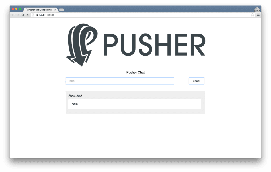
The Chat Box
Now we’ll define the HTML for the chat box:
1<template id="pusher-chat-template"> 2 <div id="pusher-chat-box"> 3 <h3>Pusher Chat Latest</h3> 4 <ul id="messages"> 5 <li data-no-messages>No messages yet...</li> 6 </ul> 7 8 <form id="pusher-chat-form"> 9 <input type="text" placeholder="Hello!" /> 10 <button type="submit">Send!</button> 11 </form> 12 </div> 13</template>
We’ll also add some CSS to our component. The beauty of components is that by placing our CSS inside the <template> tag, it will be scoped to the component. Scoped CSS is awesome; it lets us write CSS for a component without a fear that it will conflict with any other CSS or mess with the page.
CSS and Shadow DOM
I’ve added some CSS to our template:
1<template id="pusher-chat-template"> 2 <style type="text/css"> 3 h3 { 4 color: red 5 } 6 </style> 7 8 <div id="pusher-chat-box">...</div> 9</template>
However, this CSS isn’t scoped! If you had another h3 to index.html, you’ll see that it also turns red. The problem here is that we haven’t created our shadow root. When we give an element a shadow root it creates a new scope for the element, containing all its HTML, JS and CSS that won’t leak out. This is the Shadow DOM specification, letting us hide CSS and HTML within a component. We just need to update our createdCallback to create a shadow root:
1PusherChatProto.createdCallback = function() { 2 var template = importDoc.getElementById('pusher-chat-template'); 3 var clone = importDoc.importNode(template.content, true); 4 var shadowRoot = this.createShadowRoot(); 5 shadowRoot.appendChild(clone); 6 var pusherInstance = new Pusher('c5025a4d323becdd404b'); 7}
And now our CSS is only applied to our component. Great! We won’t focus too much on CSS styling in this tutorial, but I’ve added some nicer CSS which you can find on the GitHub repository.
Subscribing to the chat channel
Now we can subscribe a user to the messages channel, which is where the server will push new messages, and bind to the new_message event that the server will send. I then search for the list item that shows “No messages yet” and remove it. Notice how I now query shadowRoot for the elements, as all the HTML his encapsulated within the Shadow DOM for this element.
1var pusherInstance = new Pusher('c5025a4d323becdd404b'); 2var channel = pusherInstance.subscribe('messages'); 3channel.bind('new_message', function(data) { 4 var noMessages = shadowRoot.querySelector('[data-no-messages]'); 5 if (noMessages) noMessages.parentNode.removeChild(noMessages); 6 console.log('got new message', data); 7});
When we get a new message it will have three data points: the text, the username and the time that it was sent. We’ll then add a list item to the page that contains this information:
1var li = document.createElement('li'); 2li.classList.add('chat-message'); 3var userSpan = document.createElement('span'); 4userSpan.textContent = 'From: ' + data.username; 5var textP = document.createElement('p'); 6textP.textContent = data.text; 7 8li.appendChild(userSpan); 9li.appendChild(textP); 10 11shadowRoot.querySelector('#messages').appendChild(li);
Sending new messages
To send a new message we need to bind to the form’s submit event and make a POST request to the Sinatra server. I’ll use the new fetch API to do this. It has pretty good browser support, but it’s also easily polyfilled.
1var form = shadowRoot.querySelector('#pusher-chat-form'); 2form.addEventListener('submit', function(e) { 3 e.preventDefault(); 4 fetch('http://localhost:4567/messages', { 5 method: 'POST', 6 headers: { 7 'Accept': 'application/json', 8 'Content-Type': 'application/json' 9 }, 10 body: JSON.stringify({ 11 text: form.querySelector('input').value, 12 username: this.getAttribute('name'), 13 time: new Date() 14 }) 15 }); 16}.bind(this), true);
We firstly find the form by searching through the shadow root to find it, and listen to the submit event. When we get it, we make a POST request. We need to send three pieces of data to the server: the text from the user, their username and the current time. We’ll grab the text by finding the input box and grabbing the value out of it. We’ll use this.getAttribute('name') to access the value of the name attribute that was passed into the component, and new Date() to give us a timestamp. That data gets sent to the server which in turn triggers a new Pusher event. With that we have our chat box working!
Although everything is working there’s definitely some tidying up we can do with our code. Our createdCallback function is pretty large, but we can break it down into various methods that are all defined on the prototype, so it’s a bit more readable.
First I’ll define handleFormSubmit, which takes the username that we’ve been given and the form, and configures the data to be sent to the server:
1PusherChatProto.handleFormSubmit = function(form, username) { 2 form.addEventListener('submit', function(e) { 3 e.preventDefault(); 4 fetch('http://localhost:4567/messages', { 5 method: 'POST', 6 headers: { 7 'Accept': 'application/json', 8 'Content-Type': 'application/json' 9 }, 10 body: JSON.stringify({ 11 text: form.querySelector('input').value, 12 username: username, 13 time: new Date() 14 }) 15 }); 16 }, true); 17}
I’ll then define handlePusherMessage, which takes the data from a Pusher message and adds the list item to the page:
1PusherChatProto.handlePusherMessage = function(data) { 2 var noMessages = this.shadowRoot.querySelector('[data-no-messages]'); 3 if (noMessages) noMessages.parentNode.removeChild(noMessages); 4 5 var li = document.createElement('li'); 6 li.classList.add('chat-message'); 7 8 var userSpan = document.createElement('span'); 9 userSpan.textContent = 'From: ' + data.username; 10 11 var textP = document.createElement('p'); 12 textP.textContent = data.text; 13 14 li.appendChild(userSpan); 15 li.appendChild(textP); 16 17 this.shadowRoot.querySelector('#messages').appendChild(li); 18}
To make all this work I’m also going to store shadowRoot as this.shadowRoot, so it’s accessible from other functions, before then calling the two newly created functions. Once this is done the createdCallback code is much cleaner:
1PusherChatProto.createdCallback = function() { 2 var template = importDoc.getElementById('pusher-chat-template'); 3 var clone = importDoc.importNode(template.content, true); 4 this.shadowRoot = this.createShadowRoot(); 5 this.shadowRoot.appendChild(clone); 6 7 var pusherInstance = new Pusher('c5025a4d323becdd404b'); 8 9 var form = this.shadowRoot.querySelector('#pusher-chat-form'); 10 this.handleFormSubmit(form, this.getAttribute('name')); 11 12 var channel = pusherInstance.subscribe('messages'); 13 channel.bind('new_message', function(data) { 14 this.handlePusherMessage(data); 15 }.bind(this)); 16}
Conclusion
We’re done! With that we now have a functioning PusherJS chat component that anyone can take and use. If you’d like to go through all the code in detail you can find it on GitHub.
The beauty of web components is anyone who wants to use the component doesn’t need to know how Pusher works, how the chat works, what the HTML / CSS is, or any of that. They just need to add one line:
1<link rel="import" href="/pusher-chat-component/pusher-chat.html" />
And then use the new component:
1<pusher-chat name="Jack"></pusher-chat>
This ability to encapsulate all behaviour, semantics and styling of a component in one easy package that others can use is incredibly powerful, and the reason that so many are excited to see web components become better supported across browsers.
In the future once the spec evolves and support improves I expect to see many developers reaching to web components – the ability to get this level of abstraction natively in the browser without external libraries is fantastic for the web. Smaller projects that might have leveraged React, Vue, or other frameworks may be able to swap to using native components and reduce their file size and increase performance.
Finally, if you’re liking the look of web components but would like something with a little extra thrown in, I highly recommend checking out Polymer. Polymer is a library maintained by Google that not only polyfills web components across browsers but adds a layer of sugar on top to make them nicer to work with. It provides common features of other libraries such as data-binding (similar to Angular) and tidies up some of the code required to create web components.
Thanks to Addy Osmani, Eric Bidelman, Adam Onishi and Phil Nash for their help and advice as I researched for this blog post. If you have any questions I’d love to hear from you – feel free to reach out on Twitter or raise an issue on the GitHub Repository.


© 2024 Pusher Ltd. All rights reserved.
Pusher Limited is a company registered in England and Wales (No. 07489873) whose registered office is at MessageBird UK Limited, 3 More London Riverside, 4th Floor, London, United Kingdom, SE1 2AQ.