- Products

- Developers
- User stories
- Blog
- Pricing

How We Redesigned Our API Dashboard
Improving our customer experience with our products has always been a focus at Pusher. Over the years we have been adding in features to our dashboard to give our customers a richer experience. We’ve recently started to build out our in-house design team, which has enabled us to improve how the user sees and interacts \[…\]
Introduction
Improving our customer experience with our products has always been a focus at Pusher. Over the years we have been adding in features to our dashboard to give our customers a richer experience. We’ve recently started to build out our in-house design team, which has enabled us to improve how the user sees and interacts with our products. What were the challenges of designing for an API product and how did we approach it?
Why Are We Doing This?
There were various reasons which led us to redesign our dashboard. In recent years, our dashboard had been slightly neglected, but it worked. So why fix something that wasn’t broken? We wanted our dashboard to better reflect Pusher’s values: being simple to use, reliable, and built with developers in mind. Did our dashboard align with this new ethos? No.
We knew that we wanted to give our customers the best possible experience with our product, so not just offering the bare bones. However, we were also very aware of the service we provide for our users, we’re an API. It was a balancing act between offering our customers helpful information whilst not bombarding them with too many unhelpful features. As an API the reality is a lot of customers integrate Pusher and never look at the app again ( this is great). But for those that do use the app, we wanted to understand how we could help them get more value out of the experience. We also wanted to make the onboarding experience as easy and quick as possible for new customers.
Getting Started
Before we dive straight into the visual aspects of the design we spend a lot of time planning out the process behind the scenes.
- Who should we involve in each stage of the project, key stakeholders?
- Which customers we should chat to and how we will manage the feedback?
- How best to approach the project; content, brainstorming, wireframing, prototyping, visuals?
- What does success look like?
- What are the personas of our customers?
- How do we want to approach it from a technical perspective?
Chat to the Experts, Our Customers
We started by going out and chatting to our customers over a coffee, emails, meetings. Taking time out to do user research can at times feel laborious, but the information you gain is invaluable. We put together some main questions that we wanted answered:
- What do you use Pusher for?
- Why did you choose Pusher?
- What would make your experience better?
It’s important not to bombard customers with questions. Instead be clear about the goals and outcome you want from the chat. Whilst a lot of the answers aligned with our thoughts we also picked up a few interesting ideas, such as slack notification ‘alerts’. After we’d gathered sufficient feedback we had a good insight into how we could improve our customer experience.
Understanding the Features and User Flows
After analysing our user research we drew up a features list for each of the pages and considered the user flows. What was the purpose of the page? What did we want the customers to see on the page? How did this tie into the user research?
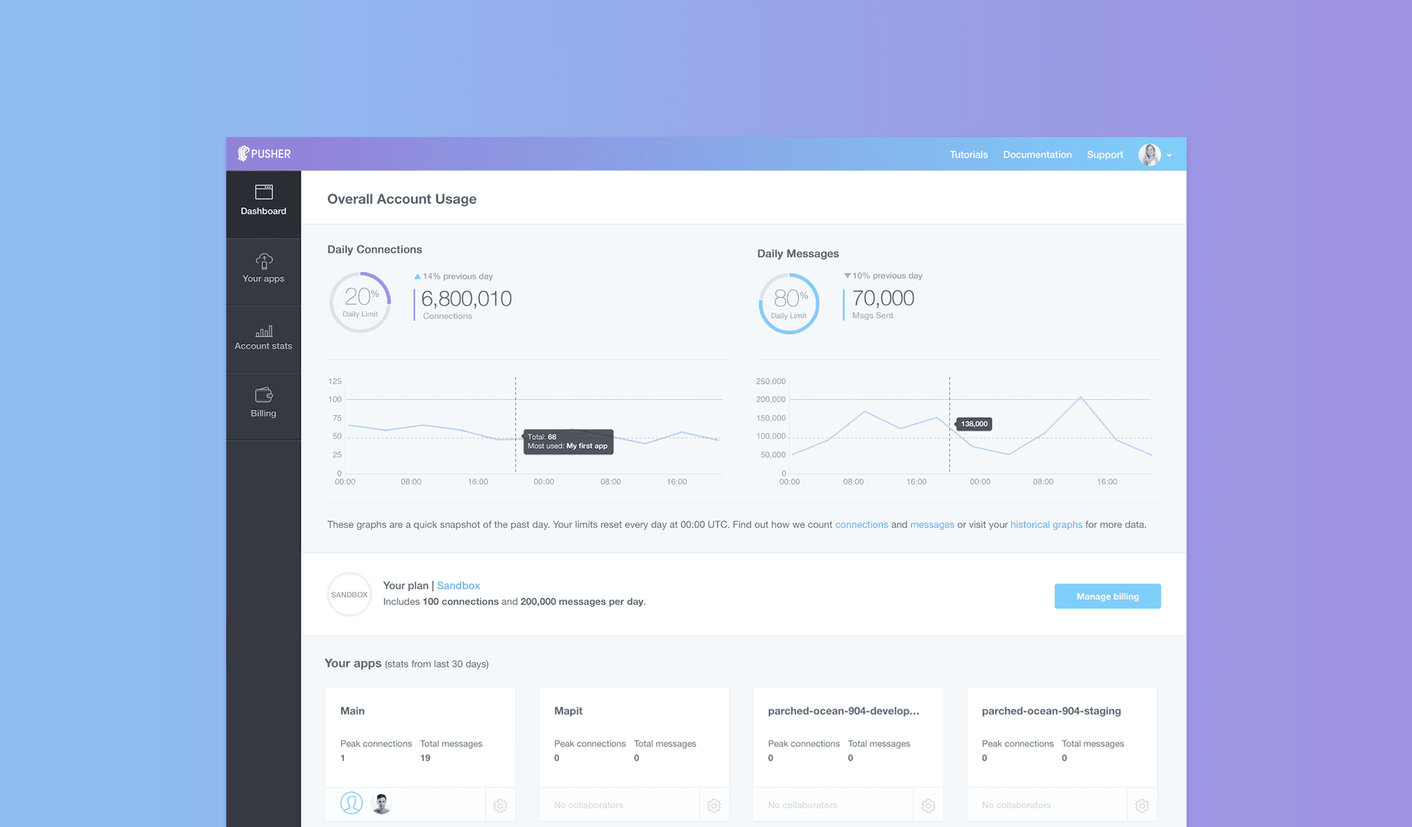
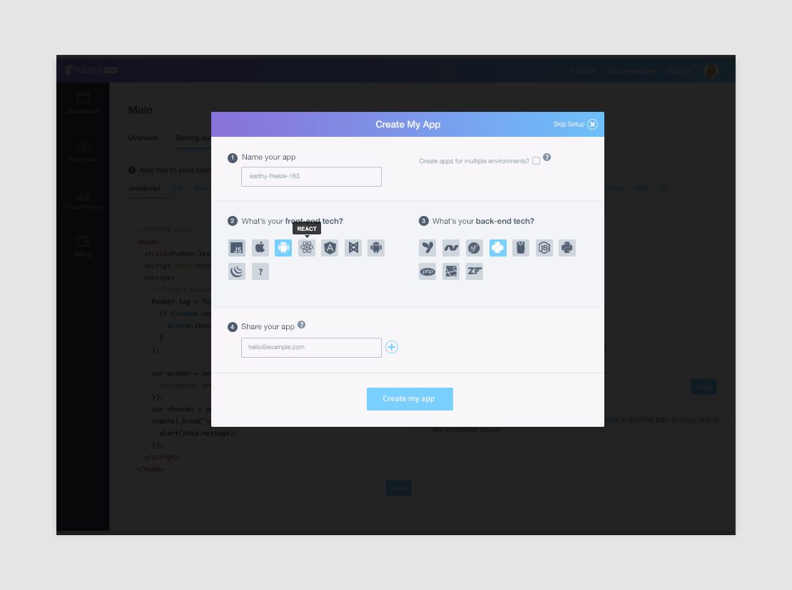
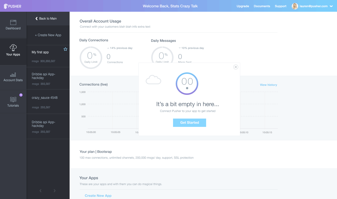
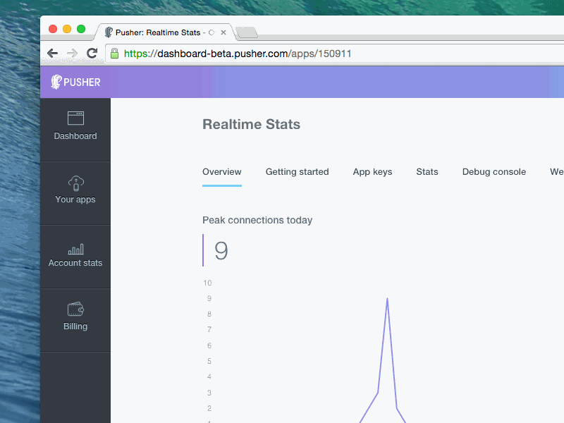
Two of the most common flows were those that wanted to get started easily and those that wanted to get a quick overview of their account usage. It was clear that our current dashboard was not addressing these needs. We came up with various solutions to address the common issues. For example, we introduced a quick setup wizard to help our users get up and running in minutes and make it easier for new users. This flow then took them to the getting started tab within the app where they could easily copy the code snippets.
Quick and Dirty
Early on in the process we knew that we wanted the app to be slick and easy to use for existing and new customers. Once we were clear on the features, flows and how we wanted to approach this, we split into a smaller more focussed team of decision makers (Product Manager, Lead Designer and Front-end Developer).
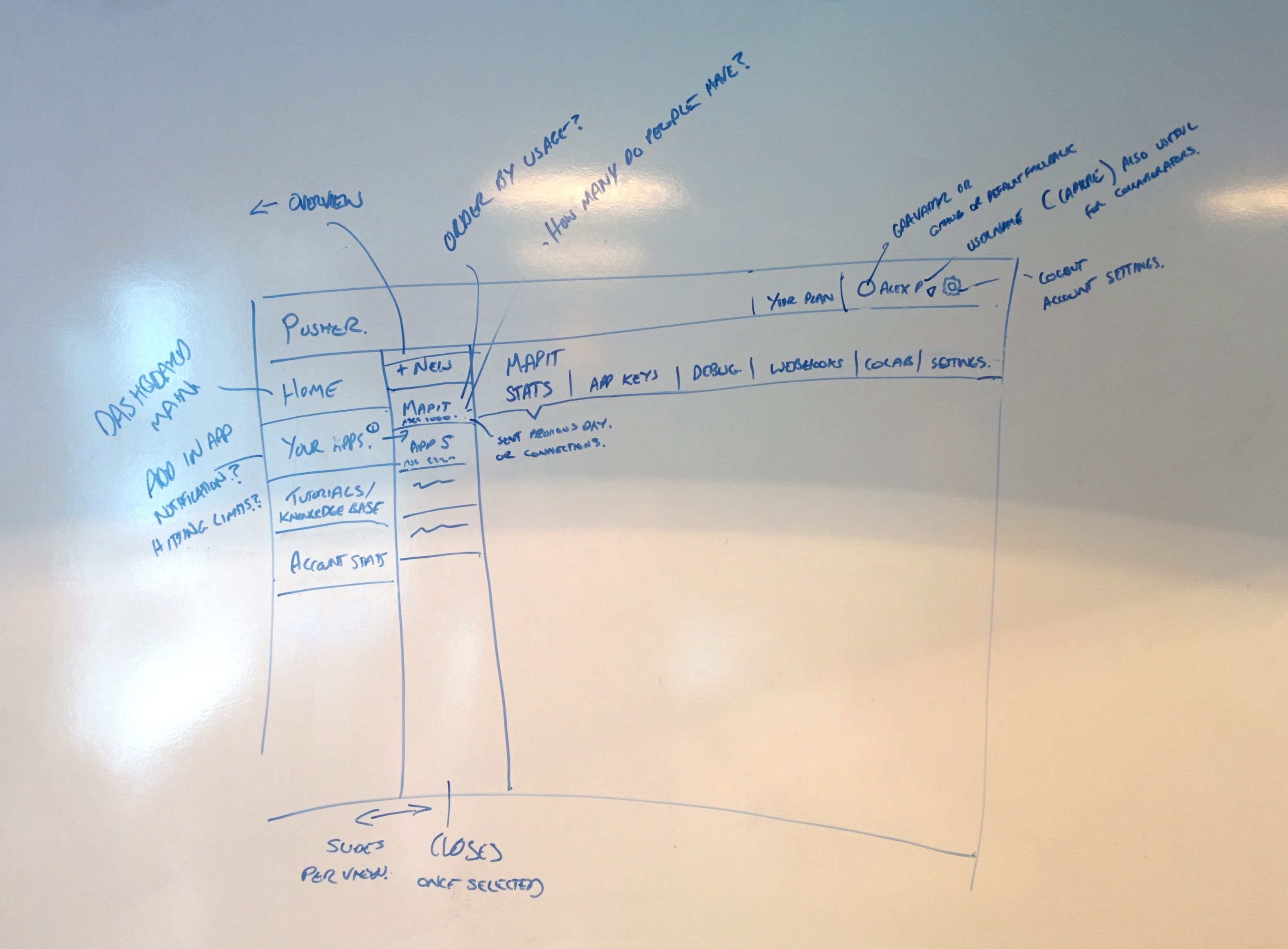
We are a transparent company and allow everyone to get involved in the different parts of the business, if they think they can contribute positively. We split the project into various parts to allow for more exploration. One of the first parts we worked on was the framework of the app navigation. We started by sketching up our vision for the app, roughly on a whiteboard, following on from the features list and user research. We discussed it as a group to make sure it was aligning with the project needs and was practical from a technical perspective. It also quickly allowed us to identify any potential flaws in the design or answer any unknown questions. Can we pull in the customer’s data such as their avatar, and if so, where from? How many realtime apps do our customers use on average?
Having Something Tangible
Once we were clear on the approach we mocked up a wireframe to make it easier to present our idea and thoughts back to the team. Wireframing is such an important part of the design process. It allows you to really think about how the product will work free from any design restrictions. Wireframes are quick to produce and adapt, so it makes the feedback loop quicker and less painful.
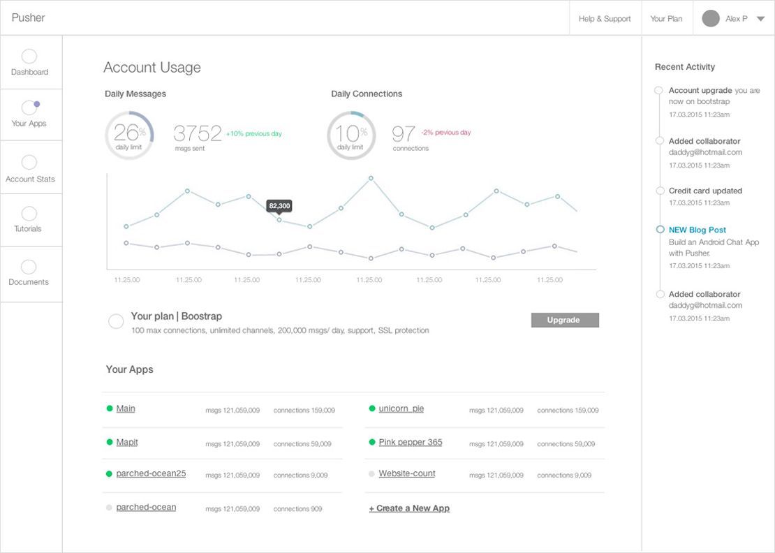
Wireframes are great, but it can be difficult to recreate genuine end-to-end interactions such as our sliding navigation or how things would load on the page. We worked on an interactive build alongside our wireframes to replicate the genuine experience. We wanted to play about with it and make sure it was intuitive for our customers and would just generally work as we had intended.
This stage is the best time to gather as much initial feedback from potential users as possible. “Fail early, fail often”. There were lots of features that we had included that later dropped, such as the ‘recent activity stream’, as they weren’t adding enough value to the end user
Look and Feel
Our goal with this project was to keep the design clean and simple. We’re a tech company and our designs should compliment our great product through clarity. We also we wanted to maintain the fun side of Pusher so it was a balancing act. Having two main colours allowed us to create individual visual identities between the connections and messages throughout the dashboard.
The look and feel were about more than just the visuals. It was important that our tone of voice also aligned with this. We wanted a versatile visual identity that could carry across all of our products and services from print to web. It was important to consider how this visual style could work seamlessly across different devices and be future proof.
Slick Animations and Responsive Design
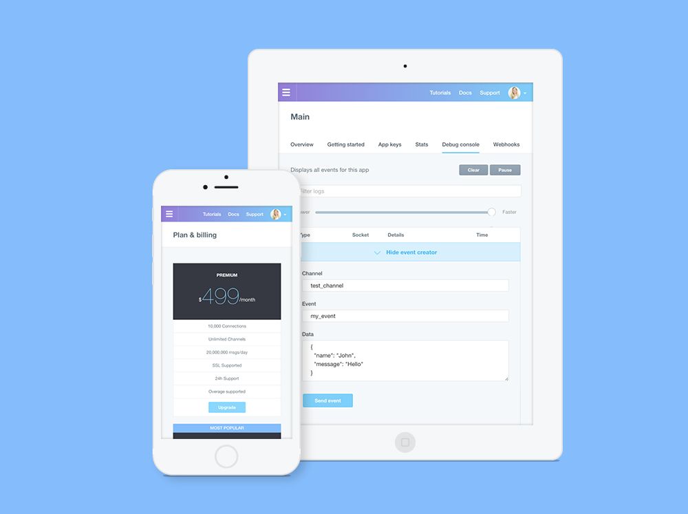
As mentioned earlier, throughout the whole process we were building out an interactive prototype. We like to get things into build as quickly as possible to allow people to play with it and make sure the interactions work across devices etc and feel natural.
It’s important to start pulling through real data early on in the design process. As designers we often fall into the trap of taking the ideal situation and designing for that. Making sure your design works for the worst case scenario is really important but often overlooked.
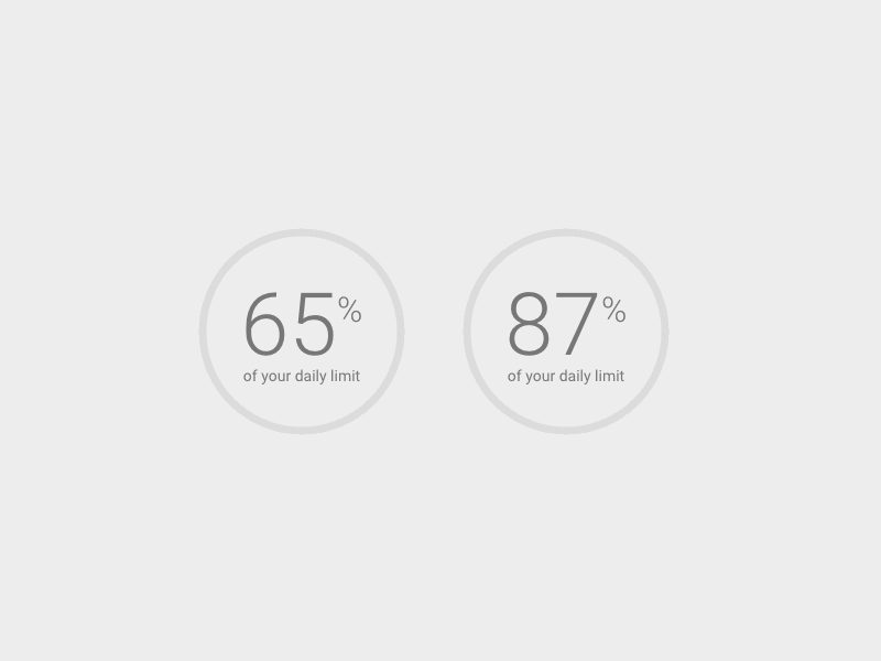
We paid a lot of attention and time to small details, such as the way we want our elements to load in and how users can get additional information from the graphs. Adding animations can enhance the user experience and help highlight certain elements. But animations can also become a nuisance and act as a distraction so getting the balance right was really important to us. It’s essential to consider how these animations will work across devices. We often try ‘cool’ animations but decide to strip them back. The usability always outweighs cool.
We opted for a slide out navigation on the sidebar to make it easier for the user to jump between and create new apps. This allowed them to access more features without having to leave the page. From the early prototypes we realised that having two navigations on the sidebar was taking up too much space on the page and was unnecessary. After various prototypes we managed to make the sidebars swap out seamlessly to give the optimum experience without restricting too much of the page.
Customer Feedback
Throughout the design process we’ve continued to work with our customers to gather valuable feedback. We wanted the dashboard to be complete enough not to send any instructions and allow them to use it as they normally would in a natural environment. The first stage was drawing up a range of our customers that we would like to try out the dashboard during the Beta stage. The chances are, only a small percentage of those asked will reply and actually want to participate. People’s time is valuable.
The user feedback was crucial at this stage but it was also important that we understood how people were using/interacting with the new dashboard. There’s lots of great software out there that allows you to easily track, replay and analyse actual users on your app. We’re currently using FullStory for this. It’s essential to use such tools, as well as the user feedback to get the full picture. Each process will gather different insights.
Our beta session ran for a week and we felt we had enough data at this point to make relevant improvements. Being able to identify patterns in feedback early on allowed us to make prompt updates and changes whilst still in beta. Some of the feedback included issues with our realtime stats loading. Some users had fallen out with our determined categories so we had issues with their usage percentage and the way we were displaying them.
Releasing it into the Wild
The perfectionist in me wanted to continue to improve the final design. However, knowing when the time is right to release your product can in itself be a skill. It’s often a balancing act between getting it to a good place visually and from a usability perspective, whilst aligning with the needs of the business. As i mentioned earlier, at the start of the project we ask ourselves “what does success look like?” This helps us identify when it’s the right time for us to release each project and whether we’ve met the project goals. The joy of digital design is that we can and will continue improve the design and experience.
The dashboard was released into the wild last week and we’re continuing to work with our customers to add value and improve the Pusher experience.
We’d love to hear your feedback on the design and process, you can find me @laurenmplews or Alex @alexjpate.


© 2024 Pusher Ltd. All rights reserved.
Pusher Limited is a company registered in England and Wales (No. 07489873) whose registered office is at MessageBird UK Limited, 3 More London Riverside, 4th Floor, London, United Kingdom, SE1 2AQ.