- Products

- Developers
- User stories
- Blog
- Pricing

A New Pusher Dashboard
Today is the second time that our dashboard has seen a significant refresh. You can take a look at it right now if you’ve not already seen it.
Introduction
Since Pusher’s inception nearly 5 years ago our dashboard that users interact with has seen a good number of updates. It has evolved along with the product itself. Today is the second time that our dashboard has seen a significant refresh. You can take a look at it right now if you’ve not already seen it.
The changes
Our goal with our dashboard has always been to make it as simple as possible to use while still providing all of the information that users need when integrating their applications with Pusher. It’s important that our dashboard exists as a useful tool that augments a user’s experience with our APIs.
The latest set of changes we’ve made to our dashboard make the experience simpler, faster, and richer. I’ll quickly go over some of new things you’ll see on our dashboard.
New landing view
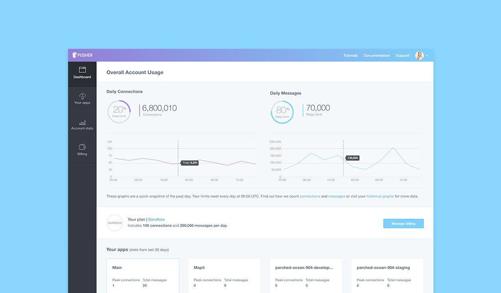
Most users interact with our dashboard a fair amount when first integrating their apps with Pusher. Once the integration is complete the need to visit our dashboard is diminished. Users only return to our dashboard if they want to setup a new integration, debug a problem, or take a look at their usage (and potentially change plans as a result).
The new view users have when landing in our dashboard looks like this:
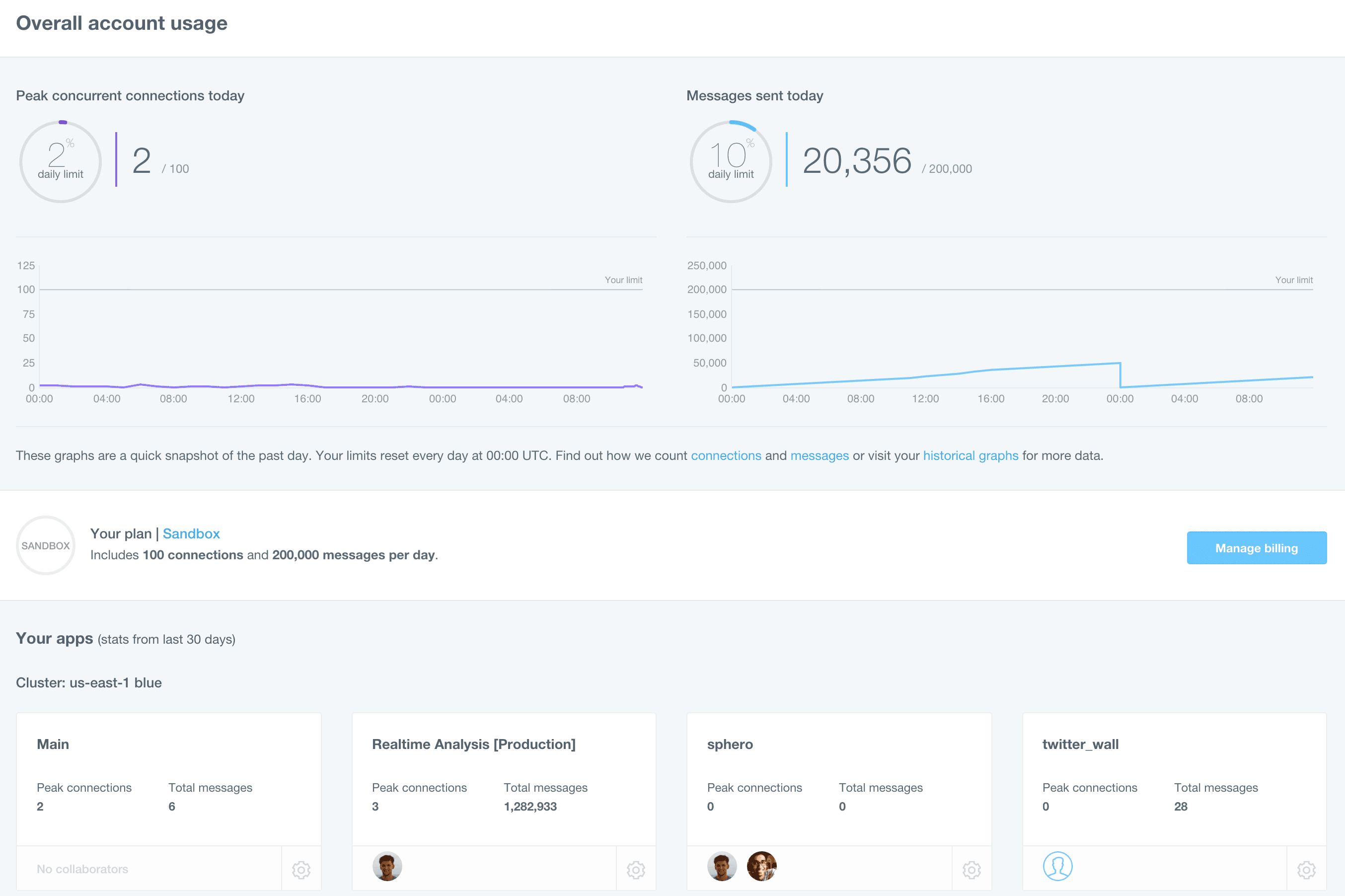
Some of this will look familiar: your apps are all still accessible from this view, although now further down the page, and you’ve got some information about your usage. Your usage is now being made much clearer though. There are figures and graphs providing immediate information as to what your account’s message and connection usage looks like. Currently the graphs show data for all of the current day as well as the previous full day.
Given how simple it is to use Pusher’s APIs we felt that it should be just as easy to get an overview of your usage. We see adding this information to the view that you’re first met by as a great first step. In fact, it is just that – a first step. As I type this we’ve got some improvements underway that will allow you a realtime view of your account’s connection and message numbers. We’re always looking to improve the visibility that we can provide users on their usage and we aim to be as transparent as possible about how we measure usage. Expect to see further improvements to the stats and graphs that are made available to users in the near future!
New app-specfic pages
App-specific pages have seen somewhat of an overhaul and are now simpler to use. Here’s a screenshot one of my apps as it appears on the new dashboard:
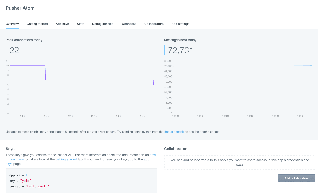
The graphs on this page show the last 30 minutes of activity for an app. As the text explains, the figures show the peak connections and the cumulative number of messages sent for the current day. The graphs update with new values roughly every five seconds, so you can keep track of exactly how many connections your app has at a given moment, as well as how many messages you’ve sent.
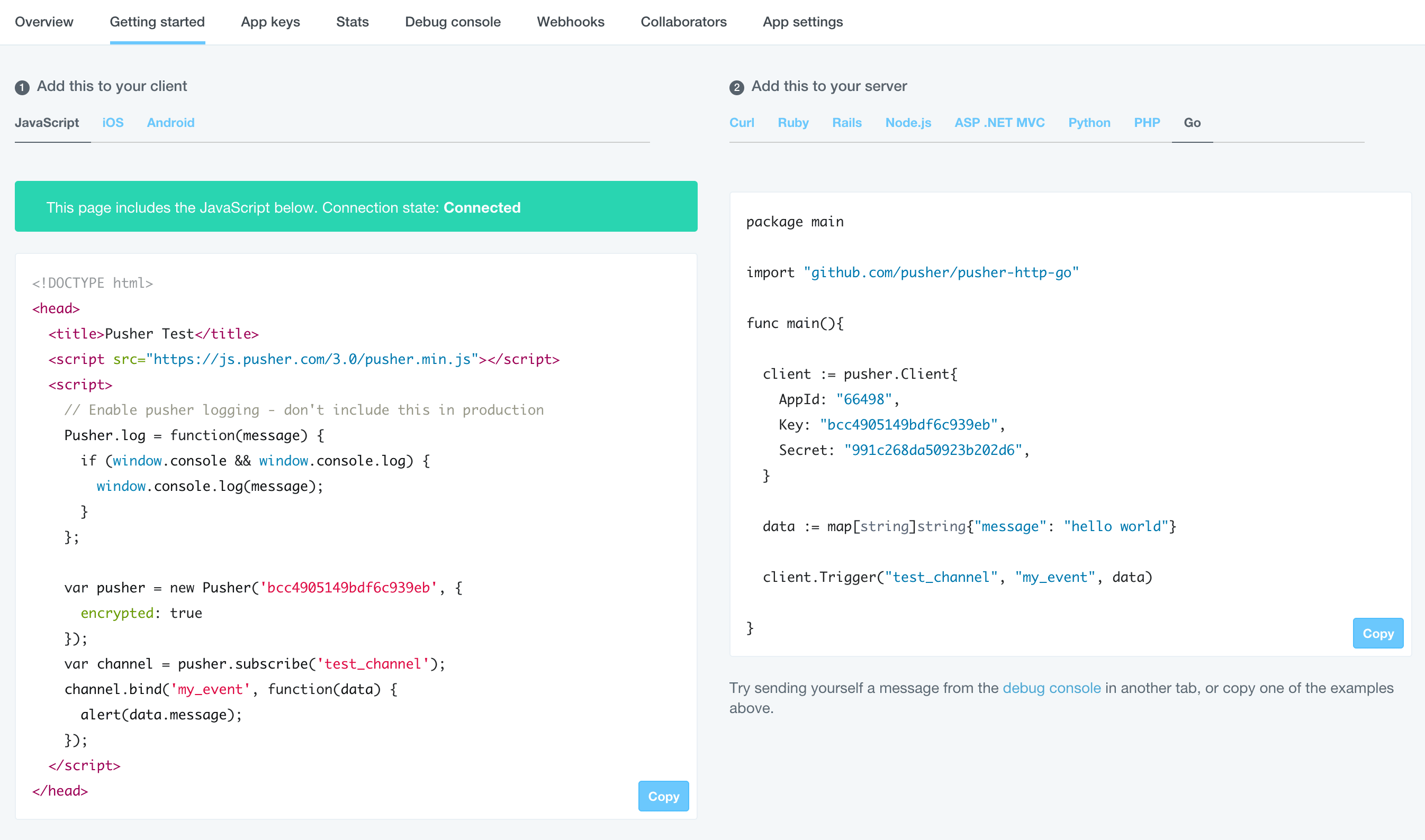
We’ve also added a tab to help users when they’re just getting started with using Pusher. It’s got code examples for all of our officially supported libraries, pre-filled with your app’s credentials. There’s now even a “Copy” button you can click to make getting your app setup with Pusher almost too easy (and before the sneaky ones amongst you go and try using the credentials in the screenshot, I’ve already revoked them ? ).
There’s more to come
I’ve very briefly covered a few of the changes that the new dashboard brings. While we think the updates to our dashboard represent a big step forward they are only the beginning. We’ve got lots of improvements planned that will make your experience with our dashboard even better.
I’d like to thank our beta testers for helping us smooth over some rough edges and point out some hard to find bugs! Moreover, while it might be me who’s written this blog post, all of the hard work that went into this update was done by Alex and Lauren so I’d like to thank them as well.
As ever, if you’ve got any feedback then please don’t hesitate to get in touch with us via our dashboard itself (look for the chat icon in the bottom right). If you’ve made it this far without trying out the new dashboard, then what are you waiting for?!


© 2024 Pusher Ltd. All rights reserved.
Pusher Limited is a company registered in England and Wales (No. 07489873) whose registered office is at MessageBird UK Limited, 3 More London Riverside, 4th Floor, London, United Kingdom, SE1 2AQ.