- Products

- Developers
- User stories
- Blog
- Pricing

Adding animations to your React Native app Part 2: Transition animations

This three part series provides a comprehensive overview of how to implement animation in React Native. In part two you will take an existing app and modify it to feature transition animations.
Introduction
Welcome to part two of a three-part series on adding animations to your React Native app. In this part, you’re going to learn how to add transition animations. Specifically, we’re going to:
- Animate the header when the user scrolls on a list.
- Customize the page transition animation that’s set by React Navigation.
- Use LayoutAnimation to animate the components that are affected by a state change.
Prerequisites
To follow this tutorial, you need to know the basics of React and React Native.
Going through part one of this series is helpful but not required. Though this tutorial assumes that you know how to implement basic animations on React Native. You should already know how to implement scale, rotation, and sequence animations. We will be applying those same concepts when implementing transition animations.
We’ll also be using version two of React Navigation. Knowledge of the Stack Navigator is helpful but not required.
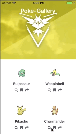
What you’ll be building
Here’s what you’ll be building:

You can find the full source code for this tutorial on its GitHub repo. We will be making changes to the final source code from the first part. If at any time you feel confused as to what specific changes you need to make, be sure to check the commit history of the branch containing the final source code for this part of the series (part2).
Setting up the project
To follow along, you first need to clone the repo:
1git clone https://github.com/anchetaWern/RNRealworldAnimations.git
After that, switch to the part1 branch and install the dependencies:
1cd RNRealworldAnimations 2 git checkout part1 3 npm install
Next, set up the android and ios folders:
1react-native upgrade
Link the native dependencies. In this case, it’s only the React Native Vector Icons:
1react-native link
Once that’s done, you should be able to run the app on your device or emulator:
1react-native run-android 2 react-native run-ios
The part1 branch contains the final output of the first part of this series. We will add new animations on top of the ones we’ve already implemented on the first part. The final source code for this part is available at the part2 branch.
Header scroll animation
First, let’s look at how we can implement header animations while the user is scrolling through a list:
To implement the animation, we need to make the following changes:
- Update the
App.jsfile to add an animated value that will be interpolated to animate the header. This animated value will correlate directly to the current scroll position. Thus allowing us to perform different kinds of animations depending on the current scroll position. - Create an
AnimatedHeadercomponent which implements the animations.
Refactor the code
Before we proceed, let’s first refactor the code. In the App.js file, move the getRandomInt function to a separate file (src/lib/random.js):
1// src/lib/random.js 2 const getRandomInt = (max, min) => { 3 return Math.floor(Math.random() * (max - min) + min); 4 }; 5 6 export { getRandomInt };
Then import it into the App.js file:
1import { getRandomInt } from "./src/lib/random";
Add the animated value
Now we can start with the implementation of the animated header.
Create a src/settings/layout.js file. This is where we keep the layout settings for the animated header:
HEADER_MAX_HEIGHT– the maximum height of the animated header. This will be the header’s default height when the user still hasn’t scrolled through the list.HEADER_MIN_HEIGHT– the minimum height of the header. This will slightly differ based on the platform the app is currently running on because the height from the top of the screen down to the actual real estate where the app is rendered will be different between the two platforms.HEADER_SCROLL_DISTANCE– the height that the scroll needs to be scrolled in order for theHEADER_MIN_HEIGHTto be applied.
1// src/settings/layout.js 2 import { Platform } from "react-native"; 3 const HEADER_MAX_HEIGHT = 250; 4 const HEADER_MIN_HEIGHT = Platform.OS === "ios" ? 40 : 53; 5 const HEADER_SCROLL_DISTANCE = HEADER_MAX_HEIGHT - HEADER_MIN_HEIGHT; 6 7 export { HEADER_MAX_HEIGHT, HEADER_MIN_HEIGHT, HEADER_SCROLL_DISTANCE };
Next, open the App.js file and import the modules that we need:
1import { View, ScrollView, Platform, Animated } from "react-native"; 2 import { HEADER_MAX_HEIGHT } from "./src/settings/layout";
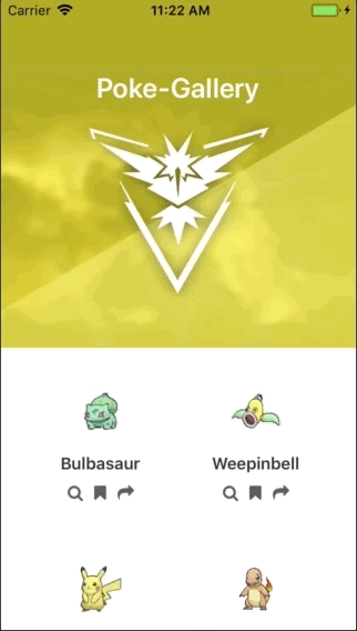
In the constructor, initialize the animated value that we will be using. By default, this should have a value of 0 because we haven’t really scrolled yet when the page loads. But iOS is different because of the content inset. We have to use the negative equivalent of the maximum height of the animated header (-HEADER_MAX_HEIGHT) as the initial value. If we just specified 0, the output will look like this:

Here’s the code:
1// App.js 2 constructor(props) { 3 super(props); 4 this.pokemon_stats = []; 5 6 // add this: 7 this.nativeScrollY = new Animated.Value( 8 Platform.OS === "ios" ? -HEADER_MAX_HEIGHT : 0 9 ); 10 } 11 // next: add code for render method
Next, inside the render method, we need to bring back the scroll value to 0. We can do that by using the Animated.add method. This allows us to add a new value to an existing animated value, in this case, it’s this.nativeScrollY. The second argument is the value you want to add.
Earlier, we’ve set the default animated value for iOS to the negative equivalent of the header’s maximum height (-HEADER_MAX_HEIGHT). So we need to add the equivalent positive value to bring it back to 0. I know it’s a bit hard to wrap your head around the idea, so consider it as a little hack to deal with the contentInset for the scrollbars in iOS. If you don’t apply it, you’ll get an issue similar to the demo earlier. Here’s the code:
1// App.js 2 render() { 3 let nativeScrollY = Animated.add( 4 this.nativeScrollY, 5 Platform.OS === "ios" ? HEADER_MAX_HEIGHT : 0 6 ); 7 8 // next: add code for rendering the CardList 9 }
Next, pass an onScroll prop to the CardList component. The value for this prop will be passed directly to the onScroll prop of the ScrollView component in the src/components/CardList.js file later on. What this does is bind the animated value to the ScrollView‘s current scroll position. We do that by using Animated.event and passing in the mapping to the native event. In this case, the nativeEvent.contentOffset.y is mapped to this.nativeScrollY:
1// App.js 2 {this.nativeScrollY && ( 3 <CardList 4 ...previously added props here... 5 onScroll={Animated.event( 6 [{ nativeEvent: { contentOffset: { y: this.nativeScrollY } } }], 7 { 8 useNativeDriver: true 9 } 10 )} 11 /> 12 )}
Next, open the src/components/CardList.js file and import the modules that we’ll need:
1import { View, FlatList, Animated, Platform } from "react-native"; 2 import { HEADER_MAX_HEIGHT } from "../settings/layout";
Extract the onScroll prop that we passed earlier:
1// src/components/CardList.js 2 const CardList = ({ 3 // ..previously extracted props 4 onScroll // add this 5 }) => { 6 // next: update render code 7 };
Next, replace ScrollView with Animated.ScrollView and supply the onScroll prop. We also need to supply a few other props:
scrollEventThrottle– this controls how often the scroll event will be fired while scrolling. Information regarding the scroll is sent over the bridge so this needs to be kept as low as possible so the app’s performance will not be impacted. The lower value means that it will be sent less often.contentInsetandcontentOffset– the offset applied for the animated header. These settings only apply to iOS. This allows us to specify the height the header is going to be. That way, the header won’t overlap the list below it. If these two aren’t applied, here’s how it will look like:
See how it jumped to its final height the moment it was scrolled?
Here’s the code:
1// src/components/CardList.js 2 return ( 3 <Animated.ScrollView 4 style={styles.scroll} 5 scrollEventThrottle={1} 6 onScroll={onScroll} 7 contentInset={{ 8 top: HEADER_MAX_HEIGHT 9 }} 10 contentOffset={{ 11 y: -HEADER_MAX_HEIGHT 12 }} 13 > 14 ..previously added scrollview contents 15 </Animated.ScrollView> 16 );
Lastly, add the styles. The important thing to remember here is that a flex property should be applied to the animated ScrollView, and the paddingTop applied to Android. This is how we deal with positioning the CardList right below the header so they don’t overlap on Android. For iOS, it’s already been taken care with the content inset so we simply set the paddingTop to 0:
1// src/components/CardList.js 2 const styles = { 3 scroll: { 4 flex: 1 5 }, 6 scroll_container: { 7 alignItems: "center", 8 paddingTop: Platform.OS == "android" ? HEADER_MAX_HEIGHT : 0 9 } 10 };
Animate the header
Now we’re ready to add the code for animating the header. First import the modules that we need:
1// src/components/AnimatedHeader.js 2 import React from "react"; 3 import { View, Text, Animated, Platform } from "react-native"; 4 import { HEADER_MAX_HEIGHT, HEADER_SCROLL_DISTANCE } from "../settings/layout";
Here’s the component:
1const AnimatedHeader = ({ title, nativeScrollY }) => { 2 if (nativeScrollY) { 3 // next: add the animation code 4 } 5 }
At this point, we can now animate based on the current value of nativeScrollY. This is the current scroll position that we will pass later on from the App.js file. As you have seen in the demo earlier, we’re actually animating multiple components at the same time:
- Header – animate the Y position.
- Background image – animate the Y position and the opacity.
- Title – animate the scale and the Y position.
From the breakdown above, you can see that we need to animate all the components involved. There’s no such thing as the inheritance when it comes to animation. Animating the header’s container won’t actually animate its children the same way. So you have to apply the individual animations that you want to use for each component.
Here’s the code for animating the header’s Y position. From the code below, you can see that we’re relying on the HEADER_SCROLL_DISTANCE for the input and output ranges. This value is the maximum height the scrollbar needs to be scrolled in order for the header to animate to its final position. So we set it as the final value for the inputRange, while the final value for the outputRange will just be its inverse. Why? Because we’re animating the Y position, applying a negative value means the component will be moved to the top:
1// src/components/AnimatedHeader.js 2 const headerTranslate = nativeScrollY.interpolate({ 3 inputRange: [0, HEADER_SCROLL_DISTANCE], 4 outputRange: [0, -HEADER_SCROLL_DISTANCE], 5 extrapolate: "clamp" // so it wont go over the output range 6 });
Here’s the code for animating the background image:
1// src/components/AnimatedHeader.js 2 // for animating the opacity 3 const BGImageOpacity = nativeScrollY.interpolate({ 4 inputRange: [0, HEADER_SCROLL_DISTANCE / 2, HEADER_SCROLL_DISTANCE], 5 outputRange: [1, 0.3, 0], 6 extrapolate: "clamp" 7 }); 8 9 // for animating the Y position 10 const BGImageTranslate = nativeScrollY.interpolate({ 11 inputRange: [0, HEADER_SCROLL_DISTANCE], 12 outputRange: [0, 100], 13 extrapolate: "clamp" 14 });
Here’s the code for animating the title:
1// for animating the scale 2 const titleScale = nativeScrollY.interpolate({ 3 inputRange: [0, HEADER_SCROLL_DISTANCE / 2, HEADER_SCROLL_DISTANCE], 4 outputRange: [1, 0.8, 0.7], 5 extrapolate: "clamp" 6 }); 7 8 // for animating the Y position 9 const titleTranslateY = nativeScrollY.interpolate({ 10 inputRange: [0, HEADER_SCROLL_DISTANCE / 2, HEADER_SCROLL_DISTANCE], 11 outputRange: [25, 35, 15], 12 extrapolate: "clamp" 13 });
And here are the animated styles:
1const headerStyles = { transform: [{ translateY: headerTranslate }] }; 2 3 const headerBarStyles = { 4 transform: [{ scale: titleScale }, { translateY: titleTranslateY }] 5 }; 6 7 const BGImageStyles = { 8 opacity: BGImageOpacity, 9 transform: [{ translateY: BGImageTranslate }] 10 };
Next, apply the animated styles to each of the components we want to target:
1return ( 2 <View style={styles.header_container}> 3 <Animated.View 4 pointerEvents="none" 5 style={[styles.header, headerStyles]} 6 > 7 <Animated.Image 8 style={[styles.header_bg, BGImageStyles]} 9 resizeMode={"cover"} 10 source={require("../img/team-instinct.jpg")} 11 /> 12 </Animated.View> 13 14 <Animated.View style={[styles.header_bar, headerBarStyles]}> 15 <Text style={styles.header_text}>{title}</Text> 16 </Animated.View> 17 </View> 18 ); 19 // next: add code for rendering default component if nativeScrollY isn't present
Next, we need to render a default component while nativeScrollY isn’t available:
1if (nativeScrollY) { 2 // ...previously added code here 3 } 4 5 // add this: 6 return ( 7 <View style={styles.header}> 8 <View> 9 <Text style={styles.header_text}>{title}</Text> 10 </View> 11 </View> 12 );
Next, add the styles:
1const styles = { 2 header_container: { 3 ...Platform.select({ 4 ios: { 5 zIndex: 1 // only applied to iOS, for some reason the cards is laid on top of the header when scrolling 6 } 7 }) 8 }, 9 header: { 10 position: "absolute", 11 top: 0, // so it's at the very top of its container 12 left: 0, // for 100% width 13 right: 0, // for 100% width 14 backgroundColor: "#B4A608", 15 overflow: "hidden", // for containing the background image because this container is absolutely positioned 16 height: HEADER_MAX_HEIGHT, // needed for absolutely positioned elements 17 zIndex: 1 // so the header will be laid on top of the list 18 }, 19 header_bar: { 20 backgroundColor: "transparent", 21 height: 32, 22 alignItems: "center", 23 justifyContent: "center", 24 position: "absolute", 25 top: 0, 26 left: 0, 27 right: 0, 28 zIndex: 1 29 }, 30 header_bg: { 31 position: "absolute", 32 top: 0, 33 left: 0, 34 right: 0, 35 width: null, // important so we can apply resizeMode=cover 36 height: HEADER_MAX_HEIGHT 37 }, 38 header_text: { 39 color: "#FFF", 40 fontSize: 25, 41 fontWeight: "bold" 42 } 43 }; 44 45 export default AnimatedHeader;
Lastly, update App.js file to use the AnimatedHeader component instead of the Header component. Don’t forget to pass the nativeScrollY prop:
1// App.js 2 import AnimatedHeader from "./src/components/AnimatedHeader"; 3 export default class App extends Component<Props> { 4 render() { 5 return ( 6 <View style={styles.container}> 7 <AnimatedHeader 8 title={"Poke-Gallery"} 9 nativeScrollY={nativeScrollY} 10 /> 11 ..previously added code here 12 </View> 13 ); 14 } 15 }
Once that’s done, you should be able to scroll the list and the header will be animated according to its current position.
Page transition animations
The next animation we’re going to implement is page transition animation, and it looks like this:
In case you didn’t notice, we’re performing a bit of a bouncing animation and an opacity animation as we navigate to the next page. We’re also doing the same as we navigate back to the previous page, but it becomes subtle because of we’re also animating the opacity back to zero.
For this animation, we’re going to use the React Navigation library. This library is like the de-facto standard for implementing navigation in React applications. So we’re going to take advantage of it instead of implementing our own navigation. This library already comes with default animations, but we’re going to customize it instead.
To implement custom page transition animations, we need to take care of the following first:
- Install the dependencies.
- Set up the main screen of the app.
- Create a new “Share” screen. This is where we’ll be navigating to so we can apply some animations.
- Set up the navigator for navigating between the Main and Share screen.
- Create a custom transition that will be applied when navigating between the two screens.
We will be moving around some code in this section. If at any time you feel unsure on what needs to be changed, you can check out the commits on the GitHub repo. I tried to be descriptive with the commit messages as much as possible, so you should be able to find the exact changes.
Install the dependencies
We will be needing the React Navigation library to implement navigation within the app. You can install it with the following command. It should already be installed if you’ve switched to the part1 branch and installed the dependencies:
1npm install --save react-navigation
Set up the main screen
First, create a screens folder inside the src directory. This is where we’ll be putting all the screens used in the app.
Next, create a Main.js file and Share.js file inside the screens folder you just created.
Open the App.js file and copy all its contents over to the Main.js file. This will now serve as the default screen of the app.
In the Main.js file, update the paths to the files that we’re importing. Simply do a multi-search and replace on your text editor, search for ./src/ and replace it with ../ and that should do the job for you. You don’t even have to mind the code below once you’ve done that:
1// src/screens/Main.js 2 import pokemon from "../data/pokemon"; 3 import pokemon_stats from "../data/pokemon-stats"; 4 5 import AnimatedHeader from "../components/AnimatedHeader"; 6 import CardList from "../components/CardList"; 7 import AnimatedModal from "../components/AnimatedModal";
Next, rename the component from App to Main:
1// src/screens/Main.js 2 export default class Main extends Component<Props> { 3 // next: add navigation options 4 }
Next, add the navigation options to be used by React Navigation:
1static navigationOptions = ({ navigation }) => { 2 return { 3 headerTitle: "", // empty because we're using the label inside the AnimatedHeader 4 headerStyle: { 5 elevation: 0, // only applied to Android to remove the shadow in the header 6 shadowOpacity: 0, // for removing the shadow in the header 7 backgroundColor: "#B4A608" 8 }, 9 headerTitleStyle: { 10 color: "#FFF" 11 } 12 }; 13 };
As for the App.js file, remove all the code from it for now.
Create a Share Screen
Next, let’s create the Share screen. I’ll just breeze through the code explanation for this screen because we’re only creating it so we could navigate to another screen. We won’t really be adding any animation code to this screen.
Here’s the code:
1// src/screens/Share.js 2 import React, { Component } from "react"; 3 import { View } from "react-native"; 4 5 import IconLabel from "../components/IconLabel"; 6 7 type Props = {}; 8 export default class Share extends Component<Props> { 9 static navigationOptions = ({ navigation }) => { 10 return { 11 headerTitle: "Share", 12 headerStyle: { 13 backgroundColor: "#B4A608" 14 }, 15 headerTitleStyle: { 16 color: "#FFF" 17 } 18 }; 19 }; 20 21 render() { 22 return ( 23 <View style={styles.container}> 24 <IconLabel 25 icon="facebook-f" 26 label="Share to Facebook" 27 bgColor="#4267b2" 28 /> 29 30 <IconLabel 31 icon="google-plus" 32 label="Share to Google+" 33 bgColor="#db4437" 34 /> 35 36 <IconLabel icon="twitter" label="Share to Twitter" bgColor="#1B95E0" /> 37 38 <IconLabel 39 icon="linkedin" 40 label="Share to LinkedIn" 41 bgColor="#0077B5" 42 /> 43 </View> 44 ); 45 } 46 } 47 48 const styles = { 49 container: { 50 flex: 1, 51 padding: 20 52 } 53 };
In the code above, we’re using an IconLabel component to render a button with an icon and label on it.
Here’s the code for the IconLabel component:
1// src/components/IconLabel.js 2 import React from "react"; 3 import { Text, TouchableOpacity } from "react-native"; 4 import Icon from "react-native-vector-icons/FontAwesome"; 5 6 const IconLabel = ({ icon, label, bgColor }) => { 7 let backgroundColor = { backgroundColor: bgColor }; 8 return ( 9 <TouchableOpacity 10 onPress={this.share} 11 style={[styles.shareButton, backgroundColor]} 12 > 13 <Icon name={icon} style={styles.icon} size={30} color="#fff" /> 14 <Text style={styles.label}>{label}</Text> 15 </TouchableOpacity> 16 ); 17 }; 18 19 const styles = { 20 shareButton: { 21 padding: 10, 22 marginBottom: 10, 23 flexDirection: "row", 24 justifyContent: "space-between" 25 }, 26 icon: { 27 flex: 2 28 }, 29 label: { 30 flex: 8, 31 marginTop: 5, 32 color: "#fff", 33 fontSize: 16, 34 fontWeight: "bold" 35 } 36 }; 37 38 export default IconLabel;
Once that’s done, you can now update the Main.js file so it navigates to the Share screen:
1// src/screens/Main.js 2 shareAction = (pokemon, image) => { 3 this.props.navigation.navigate("Share"); // add this inside the existing shareAction function 4 };
Set up the navigator
Now we’re ready to set up the navigator. There are two parts to this. First, we update the App.js file to render the Root component. This component is where the navigator will be declared:
1// App.js 2 import React, { Component } from "react"; 3 import { View, YellowBox } from "react-native"; 4 5 import Root from "./Root"; 6 7 YellowBox.ignoreWarnings([ 8 "Warning: isMounted(...) is deprecated", 9 "Module RCTImageLoader" 10 ]); 11 12 type Props = {}; 13 export default class App extends Component<Props> { 14 render() { 15 return ( 16 <View style={styles.container}> 17 <Root /> 18 </View> 19 ); 20 } 21 } 22 23 const styles = { 24 container: { 25 flex: 1, 26 backgroundColor: "#fff" 27 } 28 };
Note that I have ignored the isMounted(...) is deprecated and Module RCTImageLoader warning. Those issues only seem to come up when React Navigation is installed. I haven’t found any solution for this so let’s ignore the warning for now.
Next, let’s proceed with the Root.js file. Start by importing the modules and screens that we will be working with:
1// Root.js 2 import React from "react"; 3 import { Animated, Easing } from "react-native"; 4 import { createStackNavigator } from "react-navigation"; 5 6 import MainScreen from "./src/screens/Main"; 7 import ShareScreen from "./src/screens/Share";
Next, create a Stack Navigator for the two screens. The transitionConfig is an option that we can pass to the Stack Navigator. This is where we will be declaring the animation that we want to perform when navigating between the two screens:
1const RootStack = createStackNavigator( 2 { 3 Main: { 4 screen: MainScreen 5 }, 6 Share: { 7 screen: ShareScreen 8 } 9 }, 10 { 11 initialRouteName: "Main", // set the default page 12 transitionConfig // the animation 13 } 14 );
The transitionConfig is an object which contains the animation configuration. If you look closely, you’ll notice that it’s using the same options as the ones you use for the Animated API. The only difference is the timing property. This is the type of animation to use. We’ve previously used Animated.timing and Animated.spring, you can also use those.
Don’t forget to supply additional options for each type of animation if you want to customize it. For example, Animated.spring can have a property called friction:
1// Root.js 2 const transitionConfig = () => { 3 return { 4 transitionSpec: { 5 duration: 400, // how long the transition will take 6 easing: Easing.bounce, // easing function to use (https://facebook.github.io/react-native/docs/easing.html) 7 timing: Animated.timing, // the type of animation to use (timing, spring, decay) 8 useNativeDriver: true // delegate all the animation related work to the native layer 9 }, 10 screenInterpolator: sceneProps => { 11 // next: add code for customizing the transition animation 12 } 13 }; 14 };
Below the general animation setting is the screenInterpolator function. This is where you will specify the actual animations that you’d like to perform while the app navigates from one screen to the next.
Start by extracting all the data we need from the sceneProps:
layout– contains information about the screen layout. Things like the height and width of the screen. In this case, we’re only using it to determine the initial width (initWidth) of the current screen.position– the position of the current screen. This is the animated value that we can interpolate in order to perform animations.scene– contains information about the screen we’re navigating to. In this case, we’ll only be using it to get the index of the next screen. Remember, we’re using a Stack Navigator, so screens are just stacked on top of each other. This means the next screen will have a higher index than the current screen. Unless we’re navigating backward.
1// Root.js 2 const { layout, position, scene } = sceneProps; 3 const thisSceneIndex = scene.index; // the index of the current screen 4 const width = layout.initWidth; // the width of the current screen
At this point, we can now perform the animations. By default, the Stack Navigator uses transforms to translate the X position of the screen. If you’re navigating to a new screen, the new screen slides from right to left until it replaces the current screen. When navigating backward, the reverse is performed (the current screen slides left to right until it disappears from view. This reveals the entirety of the previous screen when it ends). The code below does the same thing, but we’re also animating the opacity. Aside from that, the transition will have a bit of bounce to it, since we applied Easing.bounce as the easing function. This will gradually fade into the next screen when moving forward, and fade the current screen out when going back:
1// Root.js 2 const translateX = position.interpolate({ 3 inputRange: [thisSceneIndex - 1, thisSceneIndex], 4 outputRange: [width, 0], 5 extrapolate: "clamp" // clamp so it doesn't go beyond the outputRange. Without this, you'll see a few black portions in the screen while navigating 6 }); 7 8 const opacity = position.interpolate({ 9 inputRange: [thisSceneIndex - 1, thisSceneIndex - 0.5, thisSceneIndex], 10 outputRange: [0, 0.2, 1], 11 extrapolate: "clamp" 12 }); 13 return { opacity, transform: [{ translateX }] }; // return the animated styles to be applied to the current view upon navigation
From the code above, you can see that we’re actually using the same Animated API that we’ve previously used. This means that you can actually apply the rotation, scale, spring, and all the other animations we’ve previously implemented. Your imagination is the limit! Don’t go overboard though, transition animations should be fast and simple to avoid annoying the user.
Note that we don’t have to specify how the position will be interpolated when going back to a previous page. React Navigation also takes care of this.
Lastly, don’t forget to export the RootStack:
1export default RootStack;
Adjust the header title
With the addition of the header added by React Navigation, we have to adjust the header title accordingly. Open the src/components/AnimatedHeader.js file and replace the following line:
1const titleTranslateY = nativeScrollY.interpolate({ 2 /*previously added inputRange and extrapolate value here*/ 3 outputRange: [25, 35, 15], // existing outputRange 4 });
With this line:
1const titleTranslateY = nativeScrollY.interpolate({ 2 outputRange: [0, -10, -8], // only replace existing outputRange with this line, other lines inside this are still intact 3 });
Because there is now a header above the animated header, we no longer have to add a Y position. We can even add a negative Y position and it won’t go over the status bar.
Solving the header issue
At this point, you should now be able to try the transition out in your device or emulator. But if you try the animated modal that we’ve implemented on the first part, you’ll see this:

The issue above is that the parent of the AnimatedModal component has a lower z-index value than the header. That’s fine because we want the header to be on top of everything else. That is, except for modal windows. This is one of the benefits of using React Native’s Modal component because it is laid on top of everything else. But we opted out of it because we wanted full control of the animations.
To solve the issue, we’ll create a new screen which shows the same contents as the AnimatedModal. And then we’ll tell React Navigation to treat the new screen as a modal, not a screen.
The first step is to copy the contents of the src/components/AnimatedModal.js file into a new file called src/screens/Details.js. The following are the changes that need to be made:
- Remove all the code that animates the Animated Modal. The animations will now be implemented using React Navigation so we no longer have to implement it on our own.
- Update the code so it no longer uses the
Headercomponent. The new Details page will be headerless. - Props should be coming from the navigation instead of supplied directly to the component.
- Add a button for closing the modal. This will simply navigate the user backward, but it will use the same animation as a modal. The screen can also be flicked downwards just like a modal does.
Once those changes are made, the code should now look like this:
1// src/screens/Details.js 2 import React, { Component } from "react"; 3 import { View, Text, TouchableOpacity } from "react-native"; 4 5 import BigCard from "../components/BigCard"; 6 7 type Props = {}; 8 export default class Details extends Component<Props> { 9 render() { 10 const { navigation } = this.props; 11 const title = navigation.getParam("title"); 12 const image = navigation.getParam("image"); 13 const data = navigation.getParam("data"); 14 15 return ( 16 <View style={styles.container}> 17 <View style={styles.modalContent}> 18 <TouchableOpacity 19 style={styles.closeButton} 20 onPress={() => { 21 navigation.goBack(); 22 }} 23 > 24 <Text style={styles.closeText}>Close</Text> 25 </TouchableOpacity> 26 <BigCard title={title} image={image} data={data} /> 27 </View> 28 </View> 29 ); 30 } 31 } 32 33 const styles = { 34 container: { 35 flex: 1, 36 backgroundColor: "#fff" 37 }, 38 modalContent: { 39 flex: 1, 40 alignItems: "stretch", 41 paddingTop: 30 42 }, 43 closeButton: { 44 alignSelf: "flex-end" 45 }, 46 closeText: { 47 color: "#333", 48 paddingRight: 10 49 } 50 };
You also need to update src/components/BigCard.js so it only initiates the animation on componentDidMount instead of componentDidUpdate. This is because it no longer resides inside the AnimatedModal component which is simply hidden from view. To do that, simply replace componentDidUpdate with componentDidMount. All the code inside of it is still intact.
Next, update the src/screens/Main.js file so it no longer uses the AnimatedModal component when the View button is clicked. It should navigate to the Details screen instead:
1viewAction = (pokemon, image) => { 2 this.props.navigation.navigate("Details", { 3 title: pokemon, 4 image: image, 5 data: this.getPokemonStats() 6 }); 7 }; 8 // next: add function declaration for getPokemonStats()
At this point, you can delete the src/components/AnimatedModal.js file as well.
Here’s the code for the getPokemonStats function:
1// src/screens/Main.js 2 // add right after viewAction 3 getPokemonStats = () => { 4 let pokemon_stats_data = []; 5 pokemon_stats.forEach(item => { 6 pokemon_stats_data.push({ 7 label: item, 8 value: getRandomInt(25, 150) 9 }); 10 }); 11 12 return pokemon_stats_data; 13 };
Next, import the DetailsScreen from the Root.js file:
1import DetailsScreen from "./src/screens/Details";
Still, on the Root.js file, we need to tell React Navigation that the Details screen should be treated as a modal. The following are the steps for doing so.
Create a new Stack Navigator. This contains the screens of the app. These are the same as what we have earlier, so all you have to do is copy the existing RootStack and paste the new one on top of the existing one then rename it to MainStack. Once that’s done, your code should look like this:
1// Root.js 2 const MainStack = createStackNavigator( 3 { 4 Main: { 5 screen: MainScreen 6 }, 7 Share: { 8 screen: ShareScreen 9 } 10 }, 11 { 12 initialRouteName: "Main", 13 transitionConfig 14 } 15 ); 16 17 const RootStack = createStackNavigator({...}); //next: add config options in place of "..."
The RootStack will now have the MainStack and the DetailsScreen as its screens. We’re also supplying an object specifying that the mode should be modal, and if it is, then there will be no header displayed. This setup works because we’ve wrapped our screens (Main and Details) inside a Stack Navigator. Thus, only the screens which are used as is will be considered as a modal:
1const RootStack = createStackNavigator( 2 { 3 Main: { 4 screen: MainStack // MainStack was previously MainScreen 5 }, 6 Details: { // existing ShareScreen is remove and replaced with this one 7 screen: DetailsScreen 8 } 9 }, 10 // replace initialRouteName and transitionConfig with below code: 11 { 12 mode: "modal", 13 headerMode: "none" // don't display a header if modal 14 } 15 );
The last step is to clean up the remaining AnimatedModal code on src/screens/Main.js. Make sure to remove this specific code from that file:
1<AnimatedModal 2 title={"View Pokemon"} 3 visible={this.state.isModalVisible} 4 onClose={() => { 5 this.setState({ 6 isModalVisible: false 7 }); 8 }} 9 > 10 <BigCard 11 title={this.state.pokemon} 12 image={this.state.image} 13 data={this.state.stats} 14 /> 15 </AnimatedModal>
Once you’ve made the necessary changes, it will now look like this:

LayoutAnimation
The last animation that we’re going to implement is LayoutAnimation, and it looks like this:
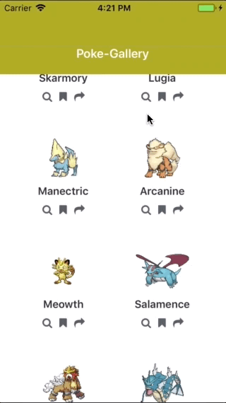
React Native’s LayoutAnimation is only useful for simple animations. These animations are automatically applied to the components whose state was recently updated.
In the demo above, we’re shuffling the array of Pokemon data when the button in the header is clicked. The state is then updated with the newly ordered data. This results in the spring animation that you see above.
LayoutAnimation can be implemented in three steps:
- Import the
LayoutAnimationmodule. - Specify the animation you want to perform when the state is updated.
- Call
LayoutAnimation.configureNextright before the state is updated.
Before we proceed, note that LayoutAnimation isn’t enabled on Android by default. This is because it’s still considered as an experimental feature in Android. For iOS, it should work by default.
Start by opening the src/screens/Main.js file and import the following:
1import { /* existing modules here */ Platform, UIManager } from 'react-native';
Then check if the platform is Android then enable LayoutAnimation:
1if (Platform.OS === "android") { 2 UIManager.setLayoutAnimationEnabledExperimental(true); 3 }
Now that that’s taken care of, let’s get into it.
First, import the LayoutAnimation module:
1// src/screens/Main.js 2 import { /* existing modules here */ LayoutAnimation } from 'react-native';
Next, specify the type of animation. This requires the type and property to be supplied:
type– the type of animation you want to perform. Currently, these includes the following preset values:easeIn,easeInEaseOut,easeOut,linear,spring.property– the property you want to animate. Currently, onlyscaleXYandopacityare available.scaleXYanimates the width and height of the component, whileopacityanimates the opacity.springDamping– how much resistance you want to apply to the spring. This should be a value that’s less than or equal to one. The lesser the number, the more spring will be applied to the component.
1// src/screens/Main.js 2 const springAnimationProperties = { 3 type: LayoutAnimation.Types.spring, 4 property: LayoutAnimation.Properties.scaleXY, 5 springDamping: 0.3 6 };
Next, construct the actual animation config. Specify the animations to be performed when a new component is rendered (create), when an existing component is updated (update), and when a component is deleted (delete). In this case, we’re specifying the same animation for all three. But you can also omit update and delete since we’ll only be using create as you’ll see later:
1const animationConfig = { 2 duration: 500, // how long the animation will take 3 create: springAnimationProperties, 4 update: springAnimationProperties, 5 delete: springAnimationProperties 6 };
Next, add an onPress prop to AnimatedHeader. The function you pass to it will be executed when the user clicks on the header button which we’ll be adding shortly:
1<AnimatedHeader 2 title={"Poke-Gallery"} 3 nativeScrollY={nativeScrollY} 4 onPress={this.shuffleData} 5 />
After that, update the AnimatedHeader so it wraps the header text with TouchableOpacity. We then pass the onPress prop to it so it gets executed when the user clicks on it. Don’t forget to destructure TouchableOpacity out of react-native first, as well as destructure onPress from the props passed to AnimatedHeader before doing this:
1// src/components/AnimatedHeader.js 2 <Animated.View style={[styles.header_bar, headerBarStyles]}> 3 <TouchableOpacity onPress={onPress}> 4 <Text style={styles.header_text}>{title}</Text> 5 </TouchableOpacity> 6 </Animated.View>
Going back to the Main screen, below is the shuffleData function. This is where the final piece of LayoutAnimation happens. Right before you update the state with the shuffled data, call LayoutAnimation.configureNext() and supply the animationConfig from earlier:
1// src/screens/Main.js 2 shuffleData = () => { 3 LayoutAnimation.configureNext(animationConfig); // configure next LayoutAnimation 4 let newArray = shuffleArray(this.state.pokemon); // randomly order the items in the array 5 this.setState({ 6 pokemon: newArray 7 }); 8 };
Don’t forget to set the default pokemon array in the state:
1export default class Main extends Component<Props> { 2 state = { 3 pokemon: pokemon 4 }; 5 }
And then set it as the data source for the CardList component:
1// this is inside the render method of src/screens/Main.js 2 <CardList 3 data={this.state.pokemon} 4 ...previously added props 5 />
The shuffleArray function is declared in the src/lib/random.js file:
1const shuffleArray = arr => { 2 return arr 3 .map(a => [Math.random(), a]) 4 .sort((a, b) => a[0] - b[0]) 5 .map(a => a[1]); 6 }; 7 export { /* existing exports here */ shuffleArray };
Don’t forget to import it into the src/screens/Main.js file:
1import { /* existing imports here */ shuffleArray } from "../lib/random";
Once that’s done, the spring animation is performed when you click on the header text.
Conclusion
That’s it! In this tutorial, you’ve learned how to add transition animations to your React Native app. As you have seen, the React Navigation library made it easy for us to implement custom page transition animations. You’ve also seen that when it comes to animations, there are a few changes for each platform that we need to deal with before we can implement the same animations.
The full source code for this tutorial is available on this GitHub repo. Be sure to switch to the part2 branch if you only want the final output for this part of the series.


© 2024 Pusher Ltd. All rights reserved.
Pusher Limited is a company registered in England and Wales (No. 07489873) whose registered office is at MessageBird UK Limited, 3 More London Riverside, 4th Floor, London, United Kingdom, SE1 2AQ.