- Products

- Developers
- User stories
- Blog
- Pricing

Adding animations to your React Native app Part 1: Basic animations

This three part series provides a comprehensive overview of how to implement animation in React Native. In part one you will take an existing app and modify it to feature basic animations including spring, scale and rotate.
Introduction
Animations are an important part of the user experience, especially for mobile apps. Animations provide users with a clear feedback when they’re interacting with the UI elements in the app. Animations bring the app to life through the use of movement. We will be using react native to implement animation.
Whenever the app needs to perform a long operation, animations can be used to entertain the user. At the same time, it can also be used to inform the user of the operation’s status. Most importantly, animations can be used to teach the user how to interact with the app. This is through the use of meaningful transitions when hiding or showing UI elements.
In this series, we’ll be taking a look at how we can implement animations in a React Native app. In each part, you will learn the following:
- How to implement basic animations such as scale, spring, and transform.
- How to implement transition animations when users navigate from one page to another.
- How to implement gesture animations when users interact with UI elements.
Prerequisites
In order to follow this tutorial, you must have basic knowledge of React and React Native. This tutorial assumes that you have a working knowledge of the following concepts:
- State
- Refs and Props
- Component lifecycle methods
- Class-based and functional components
Aside from that, you should also be familiar with some ES6 features. Things like object destructuring and spread operator.
I also assume that your computer is set up for React Native development. If you’re using Expo, you can also follow along as this tutorial doesn’t require the use of any native modules. But I’ll let you handle the modifications required to get the app running.
What you’ll be building
Throughout the whole series, we’re going to build just a single app. We will be adding the animations mentioned above as we go along.
On the first part of the series, here’s what the final output is going to look like:
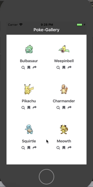
The app is going to be a Pokemon gallery app where users can view the details of a Pokemon. The app will have a minimal functionality to keep the focus on animation.
Setting up the React Native project
In order for us to get to the animation part as soon as possible, I’ve already set up a React Native project which has all the screens and components that the app requires. You can clone it using the command below:
1git clone https://github.com/anchetaWern/RNRealworldAnimations.git
The repo defaults to the master branch which contains the final output for the whole series. Switch to the starter branch so you can follow along with this part of the series:
1cd RNRealworldAnimations 2 git checkout starter
After switching, install all the required packages:
1npm install
Next, execute the following in order to add the android and ios directories:
1react-native upgrade
The project uses React Native Vector Icons, and it needs to be linked to the native project, so execute the following as well:
1react-native link
Once it’s done installing, you should be able to run the app on your emulator or device:
1react-native run-android 2 react-native run-ios
Scale animation
The first type of animation we’re going to implement is a scale animation and it looks like this:

What we want to do is to scale up the size of the card as the user is pressing the card. We then scale it back down once they release it. The component that we will be working on is the Card component (src/components/Card.js).
Animations in React Native can be implemented through the following steps:
- Import the animation modules.
- Declare an animated value.
- Specify how the animated value will change over time.
- Set the animated style and render an animated version of the component.
- Start the animation.
The first step is to import the animation modules. React Native already provides modules that allow us to add animations to our apps, go ahead and import them:
1// src/components/Card.js 2 import { 3 // previously imported modules 4 Animated, // provides methods for animating components 5 Easing // for implementing easing functions 6 } from "react-native";
Next, declare an animated value. In a functional component like the Card component, this can be done right before you return the component to be rendered:
1const Card = ({ 2 // props destructuring 3 }) => { 4 let scaleValue = new Animated.Value(0); // declare an animated value
In the above code, we’re initializing an animated value to zero. Most of the time, this is what you’ll want to do. This is because every component always starts out as static, they only move once the user interacts with it or it becomes visible in the foreground. The updating of this animated value is what allows us to move components as you’ll see later on. It has the same idea as the state though animated values are specifically used for animations.
The next step is to specify how the animated value will change over time. All animated values come with an interpolate method which allows us to update its value once the animation is started. This method accepts an object containing an inputRange and outputRange properties. Each one has an array value which maps to one another:
1const cardScale = scaleValue.interpolate({ 2 inputRange: [0, 0.5, 1], 3 outputRange: [1, 1.1, 1.2] 4 });
When I said “maps to one another”, I mean this:
- 0 → 1
- 0.5 → 1.1
- 1 → 1.2
We’ve already initialized the animated value to 0. This is one of the values we’ve specified in the inputRange, and the corresponding outputRange value for that is 1. The outputRange in this case refers to the scale factor of the component. 1 means it’s the same as its original size because any integer that you multiply by 1 will always be equal to itself.
Next, is 0.5 is to 1.1. This means that when the animation gets halfway through its peak, we want to scale the component so it’s 10% bigger than its original size. And by the time the animation reaches its peak, we want it to be 20% bigger. Note that we only need to specify a sample for the input and output ranges. The animation library will automatically figure out anything in between the numbers you specified. This ensures that the animation is as smooth as possible.
The next step to implement the animation is to set the animated style and render an animated version of the component. All you have to do is to replace <View style={styles.card}> with <Animated.View style={transformStyle}>. So you’re essentially wrapping the entire contents of the Card component with Animated.View. Here’s what that looks like in code:
1let transformStyle = { ...styles.card, transform: [{ scale: cardScale }] }; 2 3 return ( 4 <TouchableWithoutFeedback> 5 <Animated.View style={transformStyle}> 6 <Image source={item.pic} style={styles.thumbnail} /> 7 <Text style={styles.name}>{item.name}</Text> 8 <View style={styles.icons}> 9 <IconButton 10 icon="search" 11 onPress={() => { 12 viewAction(item.name, item.full_pic); 13 }} 14 data={item} 15 /> 16 <IconButton icon="bookmark" onPress={bookmarkAction} data={item} /> 17 <IconButton icon="share" onPress={shareAction} data={item} /> 18 </View> 19 </Animated.View> 20 </TouchableWithoutFeedback> 21 );
On the first line of the code above, we’re creating a new style object composed of the card’s default style (styles.card) and the transform styles. If you’re familiar with CSS animations, this should make sense to you. But if not, the code above is using a CSS scale transform declaration to scale the size of the card based on the current value of the animated value.
When you render an animated component, you should use the animated version. React Native comes with three primitive components: View, Text, Image and ScrollView. To use the animated versions of these, all you have to do is prefix them with Animated, so View becomes Animated.View and so on.
The last step to implement the animation is to actually start it. In the starter code, the Card component is using the onPress event handler. And yes, we can actually start the animation from there:
1<TouchableWithoutFeedback 2 onPress={() => { 3 scaleValue.setValue(0); 4 Animated.timing(scaleValue, { 5 toValue: 1, 6 duration: 250, 7 easing: Easing.linear, 8 useNativeDriver: true 9 }).start(); 10 11 cardAction(); 12 }} 13 ></TouchableWithoutFeedback>
The only problem is that the code above doesn’t really take into consideration when the user is holding down the component. If you try to run it, the component will simply go back to its original size even while the user is still holding it down.
Thankfully, the TouchableWithoutFeedback component already comes with an onPressIn and onPressOut event handlers. This allows us to capture when the user is holding down the button or when they already released it:
1<TouchableWithoutFeedback 2 onPressIn={() => { 3 scaleValue.setValue(0); 4 Animated.timing(scaleValue, { 5 toValue: 1, 6 duration: 250, 7 easing: Easing.linear, 8 useNativeDriver: true 9 }).start(); 10 11 cardAction(); 12 }} 13 onPressOut={() => { 14 Animated.timing(scaleValue, { 15 toValue: 0, 16 duration: 100, 17 easing: Easing.linear, 18 useNativeDriver: true 19 }).start(); 20 }} 21 >
Breaking down the code above, first, we go through the body of the onPressIn method. First, we set the animated value to 0. This effectively resets the animation everytime the user initiates it:
1scaleValue.setValue(0);
Next, we start the animation by using the timing animation. This allows us to update the animated value over a specific period of time. This method accepts two arguments: an animated value, and an object containing the settings to use for the animation.
In the code below, we’re telling it to update the animated value to 1 over the course of 250 milliseconds and it will use the linear easing function:
1Animated.timing(scaleValue, { 2 toValue: 1, // update the animated value to 3 duration: 250, // how long the animation will take in milliseconds 4 easing: Easing.linear, // easing function to use (https://facebook.github.io/react-native/docs/easing.html) 5 useNativeDriver: true // delegate all the animation related work to the native layer 6 }).start(); // start the animation
When the user releases the component, all we have to do is bring back the animated value to its initial value over a specific period of time. This effectively reverses the animation by scaling back the size of the component:
1onPressOut={() => { 2 Animated.timing(scaleValue, { 3 toValue: 0, // reset the animated value to 0 4 duration: 100, // animate over 100ms 5 easing: Easing.linear, 6 useNativeDriver: true 7 }).start(); 8 }}
Note that when you’re working with animations that are triggered by user controls, you want to use React Native components that don’t already have built-in animation behavior. In the case of a button, React Native also has Button, TouchableOpacity and TouchableNativeFeedback components. These are all pretty much the same, but they all have built-in animation behavior when a user interacts with them. That’s why we used TouchableWithoutFeedback to have full control over the animation without the need to override built-in behavior.
Rotate animation
The next type of animation is a rotate animation and it looks like this:

Here we want to rotate or spin the buttons whenever the user presses on it. It has the same mechanics as the scale animation of the Card component earlier, the only difference is that we’re rotating the component instead of scaling it.
This time, we’ll be working with the IconButton component (src/components/IconButton.js). IconButton is a class-based component, and the best place to declare an animated value is inside the constructor:
1constructor(props) { 2 super(props); 3 this.rotateValue = new Animated.Value(0); // declare animated value 4 }
Inside the render method, we specify how the animated value will change. Since we’re doing a rotate animation, the outputRange is different. This time, we’re using a string value which specifies the degrees the animated value will rotate:
1render() { 2 const { icon, onPress, data } = this.props; 3 4 let rotation = this.rotateValue.interpolate({ 5 inputRange: [0, 1], 6 outputRange: ["0deg", "360deg"] // degree of rotation 7 }); 8 // next: add transformStyle 9 }
Next, declare the styles for rotating the component:
1let transformStyle = { transform: [{ rotate: rotation }] };
Render the component:
1<TouchableWithoutFeedback 2 onPressIn={() => { 3 Animated.timing(this.rotateValue, { 4 toValue: 1, 5 duration: 700, 6 easing: Easing.linear 7 }).start(); 8 onPress(data); 9 }} 10 onPressOut={() => { 11 Animated.timing(this.rotateValue, { 12 toValue: 0, 13 duration: 350, 14 easing: Easing.linear 15 }).start(); 16 }} 17 > 18 <Animated.View style={transformStyle}> 19 <Icon 20 name={icon} 21 style={styles.icon} 22 size={icon_size} 23 color={icon_color} 24 /> 25 </Animated.View> 26 </TouchableWithoutFeedback>
As you can see from the code above, the code for starting and stopping the animation is pretty much the same as the scaling animation. We animate towards the desired value when the user interacts on it, then we reverse it when the user releases.
Another thing to notice is that we’re not animating the component itself, but its child (Animated.View). Note that the component that’s being animated doesn’t always need to be a child of the component being interacted upon (TouchableWithoutFeedback). It can be anywhere else in the render tree. As long as the component you want to animate is currently being rendered (it doesn’t have to be visible), you can animate it.
Spring animation
The next type of animation is a spring animation and it looks like this:
This time, we’ll be working with the AnimatedModal component (src/components/AnimatedModal.js). Currently, it’s not “Animated” yet so let’s go ahead and do that.
Unlike the two previous components we’ve worked with so far, this one relies on the state. If you open the App.js file, the modal is opened when isModalVisible is set to true:
1viewAction = (pokemon, image) => { 2 // ... 3 this.setState({ 4 // ... 5 isModalVisible: true 6 }); 7 }
Then inside the render method of AnimatedModal, by default, we set its bottom value to be equal to the negative value of the screen’s height. This effectively hides the component from view. When isModalVisible is set to true the bottom value is updated to 0. This returns the component back to its original position:
1import { 2 /* previously imported modules here */ 3 Animated, // add this 4 Easing // add this 5 } from "react-native"; 6 const { height, width } = Dimensions.get("window"); 7 8 type Props = {}; 9 export default class AnimatedModal extends Component<Props> { 10 render() { 11 const { title, image, children, onClose } = this.props; 12 let bottomStyle = this.props.visible ? { bottom: 0 } : { bottom: -height }; // show or hide the component from view 13 14 } 15 }
This works, but there’s really no animation taking place when the component is hidden or shown from view. Let’s go ahead and fix this:
1constructor(props) { 2 super(props); 3 this.yTranslate = new Animated.Value(0); // declare animated value for controlling the vertical position of the modal 4 }
Inside the render method, specify how the bottom value will change once the animation is started. In this case, we want the animated value (yTranslate) to be 0 at the beginning of the animation. And it will become a specific height once it finishes:
1render() { 2 const { title, image, children, onClose } = this.props; 3 4 let negativeHeight = -height + 20; 5 let modalMoveY = this.yTranslate.interpolate({ 6 inputRange: [0, 1], 7 outputRange: [0, negativeHeight] 8 }); 9 10 let translateStyle = { transform: [{ translateY: modalMoveY }] }; // translateY is the transform for moving objects vertically 11 // next: render the component 12 }
Breaking down the code above, first, we need to determine the final bottom value once the animation finishes. Here, we’re getting the negative equivalent of the screen’s height and adding 20:
1let negativeHeight = -height + 20;
But why? If you scroll down to the styles declaration of the component, you’ll find that the bottom value is set to the negative equivalent of the screen’s height:
1const styles = { 2 container: { 3 position: "absolute", 4 height: height, 5 width: width, 6 bottom: -height, // look here 7 backgroundColor: "#fff" 8 } 9 // ... other styles 10 };
So translating the Y position (vertical position) of the component to -height means that it will cancel out the bottom value declared in the styles. Remember that when two negative values are subtracted, they cancel each other out because the subtrahend (number on the rightmost portion of the equation) is converted to a positive number and the operation becomes addition:
1translateY = (-1) - (-1) 2 translateY = -1 + 1 3 translateY = 0
This effectively brings the component back to its original position. The 20 that we’re adding is the height of the uppermost portion of the screen (where the battery, time, and signal is indicated). We don’t really want the modal to replace those.
Next, apply the translateStyle to the component:
1return ( 2 <Animated.View style={[styles.container, translateStyle]}> 3 <Header title={title}> 4 <TouchableOpacity onPress={onClose}> 5 <Text style={styles.closeText}>Close</Text> 6 </TouchableOpacity> 7 </Header> 8 <View style={styles.modalContent}>{children}</View> 9 </Animated.View> 10 );
On the modal’s header, we have a TouchableOpacity which allows us to close the modal. This executes the onClose method passed as a prop from the App.js file:
1<AnimatedModal 2 title={"View Pokemon"} 3 visible={this.state.isModalVisible} 4 onClose={() => { 5 this.setState({ 6 isModalVisible: false 7 }); 8 }} 9 > 10 ... 11 </AnimatedModal>
Having done all the necessary setup, how do we actually start the animation? We know that the animation should be started when the value of isModalVisible is updated. But how do we know when the state is actually updated? Well, we can use the componentDidUpdate lifecycle method to listen for when the component is updated. This function is called every time the state is updated because we’re using a prop which relies on the state’s value (visible).
Here’s the code:
1componentDidUpdate(prevProps, prevState) { 2 if (this.props.visible) { 3 // animate the showing of the modal 4 this.yTranslate.setValue(0); // reset the animated value 5 Animated.spring(this.yTranslate, { 6 toValue: 1, 7 friction: 6 8 }).start(); 9 } else { 10 // animate the hiding of the modal 11 Animated.timing(this.yTranslate, { 12 toValue: 0, 13 duration: 200, 14 easing: Easing.linear 15 }).start(); 16 } 17 }
There’s nothing really new with the code above, aside from the fact that we’re starting the animation from a lifecycle method instead of from an event handler. Another is that we’re using a spring animation. This is similar to the timing animation, though it differs in the options that you pass to it.
The spring animation only requires you to pass toValue for the options, but here we’re passing the friction as well. This allows us to specify how much friction we apply in the spring. The higher friction means less spring or bounciness. The value we specified is close to the default value which is 7. This adds just a little bit of spring to the upward motion as the modal becomes visible:
1Animated.spring(this.yTranslate, { 2 toValue: 1, 3 friction: 6 // how much friction to apply to the spring 4 }).start();
You might be wondering why we created our own modal component instead of React Native’s Modal component. That’s because it already comes with animation capabilities. But the downside is that it’s hard to customize the animation because the default behavior gets in the way.
Width animation
The next type of animation is width animation and it looks like this:
In the above demo, we’re animating the width of the bar which represents the individual stats of the Pokemon.
This time, open the src/components/AnimatedBar.js file. If you run the app right now, the bars should just be static. What we’ll do is animate it from a width of 0 to its proper width.
Start by declaring the animated value:
1constructor(props) { 2 super(props); 3 this.width = new Animated.Value(0); 4 }
Then in the render method, we set the component’s width to be equal to the animated value:
1render() { 2 let barWidth = { 3 width: this.width 4 }; 5 return <Animated.View style={[styles.bar, barWidth]} />; 6 }
Yeah, that’s right. In the code above, we don’t actually need to specify how the animated value will change over time. Using the interpolate method is optional if all we need to animate is the component’s width, height, margin, or padding. You can still use it if you want to have fine control over how the animated value will change. But since the width is a very linear property, we don’t really need to do that. Plus the animation looks better if the width changes in uniform fashion over time.
Next, create a function which will start the animation. So that the width for each bar doesn’t get animated at the same time, we’re adding a delay that is based on the current index. The first stat (HP) will have an index of 0 so there’s no delay. The second one will have a 150-millisecond delay, the third one will be twice as that and so on. This allows us to achieve the cascading effect that you saw on the demo earlier:
1animateBar = () => { 2 const { value, index } = this.props; 3 this.width.setValue(0); // initialize the animated value 4 Animated.timing(this.width, { 5 toValue: value, 6 delay: index * 150 // how long to wait before actually starting the animation 7 }).start(); 8 };
We start the animation when the component is mounted and when its props are updated:
1componentDidMount() { 2 this.animateBar(); 3 } 4 5 componentDidUpdate() { 6 this.animateBar(); 7 }
You might be asking why we need to start the animation on both componentDidMount and componentDidUpdate. Well, the answer is that the component is only mounted once when the app is started. This is because its parent (AnimatedModal) is always rendered. It’s just hidden from view because of the negative bottom value. On the first time, the AnimatedModal is opened, the componentDidMount function in the AnimatedBar is executed. But for the succeeding views, only the componentDidUpdate function is executed.
Also, note that we’re updating the value of the stats every time the modal is opened. This allows us to still animate the width even if the user viewed a specific Pokemon twice in a row:
1// pre-written code on the App.js file 2 viewAction = (pokemon, image) => { 3 this.pokemon_stats = []; 4 pokemon_stats.forEach(item => { 5 this.pokemon_stats.push({ 6 label: item, 7 value: getRandomInt(25, 150) 8 }); 9 }); 10 }
Next, right below the mainContainer on the BigCard component, make sure that the renderDataRows function is being called. This function renders the DataRow component which in turn renders the AnimatedBar:
1// src/components/BigCard.js 2 render() { 3 /* previously written animation code here */ 4 5 return ( 6 <View style={styles.container}> 7 <View style={styles.mainContainer}> 8 ...current contents here 9 </View> 10 </View> 11 {data && ( 12 <View style={styles.dataContainer}>{this.renderDataRows(data)}</View> 13 )} 14 }
The last step is to make sure the AnimatedBar is rendered inside the DataRow component. The code for that is already pre-written, so all you have to do is make sure <AnimatedBar> is rendered somewhere inside the src/components/DataRow.js file.
Sequence animation
The last type of animation that we’re going to look at is the sequence animation and it looks like this:
There’s a lot happening in the demo above, so let’s break it down. A sequence animation is basically a collection of different animations that are executed one after the other. In the demo above, we’re performing the following animations in sequence:
- Opacity animation – changes the Pokemon’s big image from an opacity of zero to one.
- Translate animation – changes the position of the title. Starting from the top up to its proper position below the big Pokemon image.
- Scale animation – scales the size of the Pokemon’s name.
You already know how to implement the last two animations so I’m not going to explain the code for implementing those in detail. Also, note that this last animation is a bit over the top and you don’t really want to be doing this in a real-world app.
With that out of the way, let’s begin. Open the src/components/BigCard.js file and declare the three animated values that we will be working with:
1import { /* previously imported modules */ Animated, Easing } from "react-native"; 2 3 export default class BigCard extends Component<Props> { 4 // add the code below 5 constructor(props) { 6 super(props); 7 this.imageOpacityValue = new Animated.Value(0); 8 this.titleTranslateYValue = new Animated.Value(0); 9 this.titleScaleValue = new Animated.Value(0); 10 } 11 }
Inside the render method, we specify how those three values will change. Interpolating the opacity is pretty much the same as how you would interpolate the scale or the vertical position of a component. The only difference is the style. In the code below, we’re setting the opacity to that interpolated value. This is very similar to how we animated the width for the Pokemon status bars earlier:
1render() { 2 const { image, title, data } = this.props; 3 // interpolate the images opacity 4 const imageOpacity = this.imageOpacityValue.interpolate({ 5 inputRange: [0, 0.25, 0.5, 0.75, 1], 6 outputRange: [0, 0.25, 0.5, 0.75, 1] 7 }); 8 // construct the image style 9 const imageOpacityStyle = { 10 opacity: imageOpacity 11 }; 12 // interpolate the vertical position of the title 13 const titleMoveY = this.titleTranslateYValue.interpolate({ 14 inputRange: [0, 1], 15 outputRange: [0, 280] 16 }); 17 // interpolate the scale of the title 18 const titleScale = this.titleScaleValue.interpolate({ 19 inputRange: [0, 0.5, 1], 20 outputRange: [0.25, 0.5, 1] 21 }); 22 // construct the styles for the title 23 const titleTransformStyle = { 24 transform: [{ translateY: titleMoveY }, { scale: titleScale }] 25 }; 26 27 // next: render the component 28 }
Next, we render the component and assign the interpolated styles:
1return ( 2 <View style={styles.container}> 3 <View style={styles.mainContainer}> 4 <Animated.Image 5 source={image} 6 style={[styles.image, imageOpacityStyle]} 7 resizeMode={"contain"} 8 /> 9 <Animated.View style={[styles.titleContainer, titleTransformStyle]}> 10 <Text style={styles.title}>{title}</Text> 11 </Animated.View> 12 </View> 13 ...previous code here 14 </View> 15 );
Note that the titleContainer has a top value of -100. This is the starting position of the title. If you have noticed in the demo earlier, this results in the title being directly below the current local time:
1const styles = { 2 // .. other styles 3 titleContainer: { 4 position: "absolute", 5 top: -100 6 }, 7 // .. other styles 8 }
We start the animation when the component is updated. If you open the App.js file, you’ll see that the BigCard component relies on the current value of the state for three of its props. This allows us to use componentDidUpdate to listen for changes in the state:
1<BigCard 2 title={this.state.pokemon} 3 image={this.state.image} 4 data={this.state.stats} 5 />
Going back to the BigCard component, here’s the code for componentDidUpdate:
1componentDidUpdate() { 2 // reset the animated values 3 this.imageOpacityValue.setValue(0); 4 this.titleTranslateYValue.setValue(0); 5 this.titleScaleValue.setValue(0); 6 7 // start the sequence 8 Animated.sequence([ 9 Animated.timing(this.imageOpacityValue, { 10 toValue: 1, 11 duration: 1000, 12 easing: Easing.linear 13 }), 14 Animated.timing(this.titleTranslateYValue, { 15 toValue: 1, 16 duration: 300, 17 easing: Easing.linear 18 }), 19 Animated.timing(this.titleScaleValue, { 20 toValue: 1, 21 duration: 300, 22 easing: Easing.linear 23 }) 24 ]).start(); 25 }
Breaking down the code above, first, we reset the individual animated values, then we start the sequence animation. The sequence method accepts an array of animations. In this case, we’re only using timing animations, but you can actually mix in spring and decay. Another difference is that we only start the sequence animation itself, not the individual animations inside it.
Of course, you can use the same method that we did earlier with the width animations wherein we added a delay setting. The sequence method doesn’t really allow you to specify the delay between each animation. If you want that, then there’s the stagger method.
Conclusion
That’s it! In the first part of this series, you’ve learned how to implement basic animations using React Native’s Animated API. As you have seen, implementing animations in React Native is very code-heavy. This is because it doesn’t come with components that allow you to easily implement even the most basic types of animations. But that’s the price we have to pay for having finer control over how the animations will proceed.
We haven’t actually covered all the animation functions that the Animated library provides. Specifically, we haven’t covered:
- Animated.decay
- Animated.parallel
- Animated.stagger
Be sure to check out the docs if you want to learn about those.
You can check the final source code for this part of the series on its own branch (part1).
Stay tuned for the second part where we will look at how to implement page transition animations.


© 2024 Pusher Ltd. All rights reserved.
Pusher Limited is a company registered in England and Wales (No. 07489873) whose registered office is at MessageBird UK Limited, 3 More London Riverside, 4th Floor, London, United Kingdom, SE1 2AQ.